3 Appreciations of Frank Santoro – 3
III.
One of my very favorite books in my collection of “fine” art books is a collection of Erotic Watercolors by Rodin. The stunning images are mostly pencil drawings with watercolor washes. The rendering of the figures is minimal, a few curved pencil lines that look tossed off in a few moments, and maybe they are. Behind those lines, though, is a masterful sense of composition, line, and observation that looks easy but is nearly impossible to replicate–similar in that way to the deceptively simple lines of John Porcellino. Reading Santoro’s work often gives me a feeling similar to looking at that Rodin book (or Picasso’s etchings illustrating Ovid). What makes Santoro’s work even more interesting in the context of comics is the way he varies his style within the same work. A realistic landscape is juxtaposed with an almost completely abstract figure. An iconic, tightly drawn face is juxtaposed with a head that is no more than an oval outline.
This type of stylistic variation is almost never seen in comics, and where it is, the styles are most often used to differentiate two different narrative levels. A story within a story is given a different veneer, such as R Sikyorak’s comics within the comic in James Sturm’s and Guy Davis’s Unstable Molecules or the connected narratives of Paul Hornschemeier’s Three Paradoxes. Santoro varies his style within the same work, not to differentiate narrative levels, but for expressive effect.
I have already discussed some of the stylistic variations in the landscapes of Storeyville, and the characters share a similar variation. They are drawn with a similar sense of specificity and abstraction, like the gestural drawings of a painting that capture the overall sense of posture and movement while neglecting details. Often existing only as loose black outlines with the most of minimal of facial features, they still exist in the panel with a life-like realism. This loose realism works in great contrast to the majority of comics. Santoro captures the essence of the figures in a way that is less about iconic simplicity and more about a minimally rendered life.

This loose minimalist drawing allows for subtle variations in style that are recognizable and expressive without being jarring and discordant. Often this shift in style is used to echo the narration or internal emotion of Will. In one page Will’s narration over his concern of “dwindling finances” and the sense of being lost is mirrored by the bare, geometrically abstract panels: backgrounds become minimal lines, often only a single horizon line; characters become even more loosely rendered, practically scribbled as Will walks this way and that across the page. [See above] The contrast between pencil and ink is well used, the pencils often serving to delineate objects at a distance, disappearing into the background, or even metaphorically at a distance (memory or thought).

In one of Chimera‘s last pages, as the couple walks together, two juxtaposed panels show a striking difference between the woman’s representaton. [See above] The first panel shows the man peering around a tree at the woman, half hiding. In the second panel he has came around the tree and they are face to face. In the first panel, the woman is drawn as an extremely abstracted black outlined yellow shape on a pink field, shorn of any details but still identifiable as the woman. The second panel shows her with facial features and hair rendered in black lines on a yellow field, a suddenly smiling face. The stylistic change echoes the hiding/discovery of the couple’s little game of peek-a-boo. Instead of hiding the woman behind the tree trunk and obscuring her completely, Santoro both shows and hides her simultaneously through the abstracted representation–a small but brilliant use of the combination of the panel sequence and drawing style for narrative effect.
These types of variations in drawing style for expressive effect are a sadly underused tool in the comic artist’s toolbox (though I should note the use in some manga of the “super-deformed” style that is interspersed for comic effect in otherwise more realist manga). Stylistic unity and consistency is a gold standard one dare not go against, yet it is one of the elements of Santoro’s work that makes it so effective and attractive. We see a similar sense of variation and beautiful inconsistency in Santoro’s most recent work, the as-yet unfinished Cold Heat.
The traditional way of making color comics involves a black line drawing that is filled in with colors. Over the decades this method has not changed greatly. The occasional comic is painted in an illustrative style, and many comics are drawn in black and use one color as a tonal variation. Computerized coloring has added to the “realism” of the colors, but most comics are still black outlines with filled in colors. Exceptions are not unknown: Austin English’s multi-colored crayons and Joann Sfar’s chaotic watercolors to pull two examples from my bookshelf.
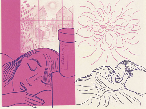
Santoro gives Cold Heat a unique appearance by taking a more graphic printmaking-esque approach to line and color. He uses a palette of blue, purple, and pink along with textures, overlapping transparencies, and flat fields in a variety of ways.
Cold Heat uses dark purple as its primary line color, but unlike the black linework in most comics, the dark purple is not used to delineate all the characters, objects, and backgrounds. Other colors are used as lines or shapes, with brush strokes, pencil graininess, and what looks like transparent marker strokes. The sheer variety of color applications in the comic provides a powerful method for mood, emotional expression, location differentiation, and composition. I can do no better than to offer a number of sample panels or groups of panels to showcase these variations and stand as their own conclusion to this article but not the comics of Frank Santoro.


[Images from Storeyville, Chimera, and Cold Heat by Frank Santoro (Cold Heat created with Ben Jones). All available from Picturebox.]