The Three Paradoxes by Paul Hornschemeier

The Three Paradoxes by Paul Hornschemeier. Fantagraphics, 2007. Color, hardcover, $14.95.
Paul Hornshemeier’s The Three Paradoxes speaks its theme loudly. To wit, these panels:
A gap between two spaces, a hesitation to movement, stuck in a loop, a mental block. This semi-autobiographical book (or fictionalized autobiography, depending on how you read “Paul Hornschemeier” the character in relation to Paul Hornschemeier the artist) not only reiterates these themes through the multiple narrative plots, but it embodies these issues in form.
“Paul” is home visiting his parents. He seems to be having writer’s block with his current comic story. He’s in expectation of a long distance female friend visiting him in a few days. He dwells upon the past when, as a boy, he was beat up by a bully. He is stuck between past and future, feeling like he is treading water in the present.
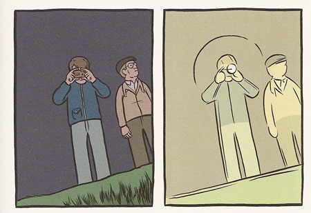
The panels above showcase the differing visual styles Hornschemeier brings to the main narrative and the 4 sub-narratives of the story. Each is done with a style that sets it apart. The present of Paul visiting his parents is done with what I consider the normal Hornshemeier style, that which I’ve seen in Mother Come Home and his Mome serial: somewhere between realism and cartoony, flat compositions and flat mostly dulled colors. The comic in progress is all blue pencil lines (which, from seeing pages at Rocketship in Brooklyn earlier this year, is the way he does his layouts). The story of “Paul’s” childhood is cartoony and abstract with off-register four color process colors (a kind of less mature version of his normal style). An intervening narrative about a boy hit by a car and getting his voice damaged is drawn with a style very similar to the present storyline but with a yellowed margins/gutters and even duller, faded colors that give the patina of age. Finally, a story about Zeno the philosopher and his paradoxes is drawn with a big-headed cartoon style and made to look like the pages of an old Dell comic from the 50s or 60s, complete with ragged yellowed “page” margins within the margins of the actual page. This stylistic shifting and virtuosity is the visual highlight of the book and it’s most immediate strength.
All these narratives relate in some way to the main theme of the gap between two spaces. In the present story, “Paul” is back at home with that quintessential sense of being out of time and place. He feels on the verge of something new, particularly with the women that is coming to visit him, yet he is also stuck dwelling on his past.
The past story starts with “Paul” reluctant to climb through a long drain pipe under the street (see panel above), but ends up showing him punished (beat up) for taking a step forward (calling out the bigger, bully kid (who is very reminiscent of Nelson from the Simpsons with his torn sleeve vest)). A second or third time through and I’m tempted to read that as a psychological starting point for the present tense “Paul’s” trouble with stasis. He took that step forward at an early age and suffered greatly for it.
The comic story in process that “Paul” is drawing shows the theme in a few variations, a kind of micro explication of the theme of the larger work, where the character is seen running around in a loop from a monster and then the monster being replaced by gap between two cliffs (this brings to mind Trondheim’s Mister O, which in light of this book, takes on a certain sense of existential punishment for attempts at progress).
The Zeno comic within the comic takes the philosophical approach to the question, showing Zeno lecturing about his paradoxes to a group of Greek philosophers (including a snotty Socrates). These paradoxes are ridiculous, but to “Paul” they trap him in a loop of questioning and mental blockage (as his Dad notes in the panel above).
The levels of narrative and commentary on each other is vertiginous the more I think about it, and, interestingly enough, I can even find a criticism for the book as a whole built into one of the sub-narratives. In the Zeno comic, his partner, Parmenides convinces Zeno to only discuss three of his paradoxes, leaving out a weaker fourth one. In the same sense, I think someone should have told Hornschemeier to stick to three sub-narratives, as the fourth is the weakest, longest, and least relevant (in my reading) of them. This sub-narrative involves a boy who is hit by a car and ends up with speech difficulty. There is the element of his hesitation (be it physical or mental) at speaking, but the story itself takes up a long 14 pages in the center of the volumes for a pay-off that is negligible.
In the end, the book as a whole embodies the theme too well: it exists between two gaps, neither her nor there. With all these building up of levels of narratives to showcase the theme of non-movement, the book itself doesn’t go anywhere. It’s fallen into a gap between form and content. The stylistic and thematic build-up is a grand display of virtuosity that feels empty once one delves beneath the surface. The Three Paradoxes is an experiment that, like many experiments fails, but it fails in an interesting way that will hopefully take Hornschemeier’s work to success in future endeavors. I’ll keep reading Hornschmeier’s work, as even in a failed experiment there is much to appreciate.
As an addendum, this two panel sequence is another example of the experimental mind at work, a simple of shifting style and color for an effect:


