One-Panel Criticism: King-Cat No. 65
This post formerly appeared at the The Panelists on January 3, 2011.
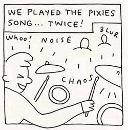
Porcellino, John. King-Cat No. 65. Spit and a Half, 2005. p.7 panel 4.
The most conventional uses for words in comics are sound and narration, both most often separated from the image, enclosed within boundaries of balloon or caption box. Less separate, but still common uses, are those such as onomatopoetic sound effects and words found in the diegetic world of the image itself (business signs, words on a t-shirt, etc.). Then there are the uncommon uses.
This panel from John Porcellino’s King-Cat No. 65 attracts me for its multifarious uses of text. The panel starts with text as narration: “We played the pixies song… twice!” This text forms part of the story’s larger narration in Porcellino’s voice and is enclosed in a caption box. In a sense, this text is separate from the image, cordoned off, while the four other words in the panel are more a part of the image. The first word, “Whoo!”, though lacking its own balloon, is a fairly conventional sound representation, though, unlike sound enclosed in a balloon, it is ambiguous in attribution: an attendee in the crowd or the figure in the foreground.
From here the words becomes less conventional in use. “Noise” floats in the air, not speech, not an onomatopoetic sound effect, rather a description. A slew of sounds (music, crowd) have been abstracted down to this single word from which we must (if we desire) imagine the components through the context. Similarly, Porcellino’s art is so simplified, so representationally abstract, that it approaches the same level of abstraction. The image is representational enough that we know what we are looking at, though for many components this is strongly dependent on context. The pieces of the drum set in this panel would be quite ambiguous (one circle inside another circle?) taken out of the context of the other pieces and the figure with his drum sticks. Like the “Noise”, we are invited to fill in any details.
Further over in the panel, “Blur” sits near two figures. Here the word strays from sound into visuals. Rather than representing or describing sound, the word describes, modulates perhaps, the image. Some might say this is a form of comics cheatery, using words to make up for a lack in the artwork, but I see it as a further level of integration between words and pictures that so many see as integral to comics. Porcellino is using words to supplement his images, one might say, to supplement the limitations of his images. The word is also pleasantly ambiguous. “Blur” could be the visual blurriness of the crowd, but it could also be a description of time passing in a “blur” as the band’s set might seem to the band members themselves (Porcellino is one of the members, thus the reading of these words from the band’s subjectivity).
Lastly the word “chaos” sits just off-center, neither sound, visual, nor narration, the word is an overarching descriptor, a summation of the panel: sound, action, and image, subtly reinforced by the figure’s breaking out of the panel borders at two points.
A few comments from the original post at The Panelists:
Charles Hatfield:
Derik Badman:
What I enjoy about Porcellino is the way the very simplicity of the drawing style enables this kind of intermix of text and image.
That text would probably look pretty silly on a photo-realist drawing.
I’ve not read Far Arden, at least not since it was first online… do you mean the text like “push-off”, etc. in page 5 of Chapter 7 (you have to click through the page). I just randomly picked a chapter and found that, so if you had a different example…
Charles Hatfield:
Yeah, I mean exactly that kind of playfulness, as when, for example, a character is shown running away to the accompaniment of a “sound effect” reading Run Away!
I love the mock-emphatic nature of these effects. And of course it’s so obvious, it’s a wonder more cartoonists don’t do these things.
Derik Badman:
Cannon’s text works for the less serious nature of his book. Despite it’s unconventional nature, it doesn’t seem as far from the “BAM POW” type text as Porcellino’s does, for some reason. I think it’s the more abstract nature of the text in the panel above.
Those Cannon images do remind me of Dash Shaw’s use of text in Bottomless Belly Button, which varies between the two, I think. Wrote about that awhile back in this post: http://OFFLINEZIP.wpsho/archives/bottomless-belly-button-by-dash-shaw
Noah Berlatsky:
Have any of you seen Tiny Titans? The use of sound effects is like this panel times ten; there are sound effects like “penguin!” used regularly.
And, hey, nice job with the design Derik. The site looks lovely. I am jealous.
Derik Badman:
Have not seen or heard of Tiny Titans.
The design is mostly the default WordPress theme. I just did some liberal editing.
Jared Gardner:
You have not seen or heard of Tiny Titans? Good lord, man! They are like the Teen Titans, but tiny. And awesome.
Derik Badman:
Even my knowledge of Teen Titans is limited to knowing that it involves Robin and the junior Wonder Woman (Girl?). And I think George Perez drew it in the 70s or 80s.
Noah Berlatsky:
You’ll get a spirit of the series if you realize that the atom and his family (the atom’s family) appear in tiny titans, and are referred to as the Tiny Tiny Titans.
Jared Gardner:
PS: Hey, Noah! Derik told me how to get those cool icons in the comments: you just sign up at gravatar.com
Ben Towle:
Pete Bagge also uses some hilarious ambiguous “sound” effects. “Barge!” is one of my favorites. Great inaugural panel for this column.
Charles Hatfield:
Off the topic of Derik’s post, but perhaps we should establish a clearinghouse or survey for favorite comics SFX?
(SPLARF would be a fave of mine, related to what I’ll be posting later this week…)
One thing I take away from the above is that the relationship of text and image is likely to be integrally connected to drawing style. Of course, all this is inseparable in the above instance from JP’s ethos, his sensibility, the unique aesthetic of King-Cat…
Charles Hatfield:
…the relationship of text and image is likely to be integrally connected to drawing style.
Exhibit A: Ware.
Alex Boney:
Exhibit B: Herriman.
Daniel Wüllner:
Dear Derik,
I love what your are doing with “The Panelists”, especially your One-Panel-Criticism.
Actually, I have been doing the same thing on my comic-blog since last June. My German blog “Neues aus dem Elfenbeinturm” (News from the ivory tower) features a series called “Hingeschaut”: Up until now I wrote 19 close readings of single panels without the complete comic in mind: http://neuesausdemelfenbeinturm.blogspot.com/search/label/Hingeschaut
Have a look if your are a little bit familiar with the German language, most of the comics I am talking about are available in English as well. Might be interesting to team up or contribute to each other’s blog.
Yours,
Daniel
Derik Badman:
Thanks, Daniel. (To be clear, I can’t take credit for the One-Panel Criticism name or concept. One of the other Panelists came up with the idea, though I have done some writing on my own site about single panel images.)
Sadly, my only language other than English is French. My German is limited to a few random nonsense phrases some friends taught me a long time ago.
Isaac Cates:
I think I was the one who originally proposed the “one-panel criticism” idea…
Matthew J. Brady:
I love some good SFX. One I remember from recent years is in, I believe, the second The Damned miniseries from Cullen Bunn and Brian Hurtt, in which a character is smashing through a door with rubble flying through that panel, and a bit CRASH working its way through the middle. I thought that was pretty cool.
It’s one of the neat things about comics, the word/picture interplay and it’s near infinite possibilities. Don Martin’s crazy words, Walt Simonson/John Workman’s bombast, Brandon Graham’s bubbly graffiti, Paul Pope’s rough expressionism, you could go on and on. I love it.
Nate:
The tilting semi-vertical lines that divide the panel between the top of the drummer’s head and the crowd add to the sound’s directional ambiguity, and really pull the composition together. I’m always impressed at how important each line is in a Porcellino drawing.
Porcellino is using words to supplement his images, one might say, to supplement the limitations of his images.
Yes! What I enjoy about Porcellino is the way the very simplicity of the drawing style enables this kind of intermix of text and image. The effects you’re talking about, Derik, I think, depend on the spare, uncluttered nature of the drawing, specifically JP’s respect for white space.
Here is the so often sought-for eloquence of the stripped-down, diagrammatic image, in contrast to the different kind of eloquence one finds in more traditionally illustrative work. The relative “emptiness” of the “empty” space makes possible a kind of handwriterly approach in which text and image are freely mixed.
What do you think of the way text labels spoof onomatopoetic SFX in Kevin Cannon’s Far Arden?