Anthology Round-Up
This post originally appeared at The Panelists on April 1, 2011.
I have a love-hate relationship with comics anthologies. I can’t seem to stop buying them, yet I’m invariably disappointed with a great majority of the contents of each one I read, leaving me with anthologies I’m saving because of one single beloved story. I’m tempted to just razor out the pages I like, but I’ve never got over my lifelong conception of the book as something that should not be harmed (excepting the occasional pencilled underline or marginal notation, which are, after all, erasable).
Some few anthologies are more successful than others. Why is that?
As I see it, the primary reason is the availability of quality material. Many anthologies often act as a kind of training ground for less experienced artists. Besides minicomics and, now, the web, anthologies are one major way for new artists to get comics out to an audience. Bolstering an anthology of lesser known artists with a handful of more experience/known artists helps attract attention and buyers (especially given the collector culture of comics) and provides exposure. Naturally this will lead to greater amounts of chaff to wheat.
A strong editorial hand is also important. It’s not easy to bring together a bunch of comics by different artists and get them to be a fairly consistent read. I’d imagine it’s also not easy to reject work. The world of comics is fairly small, and a lot of the submitters to an anthology must be friends or acquaintances of the editor. Who wants to reject their friends? Who wants to sour a relationship that could be potentially useful in the future, professionally speaking? Not many people, particularly, in the case of most comics anthologies where the editor is him or herself also an artist. I’d say the prestige of the anthology itself would also assist in the ability to: a) get better submissions and b) make it easier to reject work.
The strong editorial hand and the prestige are, I think, why the later volumes of Kramer’s Ergot are so successful. Even if you don’t like all the work in them, you can, as you read them, get a sense of curation at work. Harkham wasn’t just asking friends to contribute and then taking whatever they gave him. (Well, I assume so, but maybe his friends are just that reliable.) And because of the increasing prestige of the anthology, the artists were probably taking the work more seriously, trying to put a better foot forward, which often seems to not be the case in less known anthologies featuring known artists.
Austin English’s Windy Corner Magazine anthology is also very successful in its three issues because of English’s editorial hand. There is a consistency of the contents that speaks to the editor’s control. Windy Corner also features a limited number of participants in each volume, which seems to raise the quality. So many anthologies just have too much, too many artist to fill the pages (the quintessential example being L’Association’s Comix 2000).
Access to a variety of artists would also add to an anthologies chances at success. The Rosetta Anthology from Alternative Comics managed to have an incredible roster of international artists. Check out volume 2, edited by Ng Suat Song with Domingos Isabelinho (who both now write for The Hooded Utilitarian), with work by Anke Feuchtenberger, Martin tom Diek, Feng Zikai, Tobias Schalken, Edmond Baudoin, and tons more; it’s a strong anthology. The Drawn & Quarterly anthologies also tended to have a great selection of international and historical contents. In both these cases the anthology’s goal seemed less about new work and more about expanding horizons, a kind of cultural education.
Following this overlong preamble, I wanted to take a brief look at four anthologies I’ve read in the past month or two. Why did I buy them? What did I like best; what worked for me? I’ll try to admit to my particular prejudices as I go through them.
First up is, Closed Caption Comics #9, an anthology from the Closed Caption Comics collective (group?). I’ve heard a lot of hype about CCC, so I thought I’d try out this latest volume. This is not so much an edited anthology, as an anthology of work from the group (unless I’m understanding wrong, but no one is listed as the editor), which I guess invalidates my comments above about editorial hand. Much of the work in this volume sets off a bunch of my existing prejudices as far as taste in comics and narratives go. Many of these comics work within or use the tropes of the horror genre. I can’t think of a genre I like less than horror, I just never got into it. There’s also some Burroughs-esque science fantasy (as in Edgar Rice, not William S.) in here and some pieces playing with the action adventure genre. I guess this is the new art genre comics (or whatever you want to call the creation of genre comics from non “mainstream” artists), which isn’t to my tastes (interesting to note that the genres in the cases I can think of tend to be action/horror/sci-fi/fantasy, rather than mystery or romance or…). But there are a couple stories in here that kept this book on my shelf. The first is actually a sort of horror comic from Chris Day. I’m pretty sure it’s Chris Day. Few of the stories have names attached to them, and the table of contents is just a list of the artists in order of appearance. So you have to count your way through the book or find an artist you can identify already to figure out who is who (tables of contents and attribution of stories in anthologies are pet peeves of mine, I shouldn’t have to put work into figuring out who did a comic I like).

from Chris Day's "Moribund '74" in Closed Caption Comics 9
Day’s piece “Moribund ’74” (see above) is a series of semi-abstract imagery mixed with narrative text. Day mixes expressive ink strokes with geometric precise lines, recognizable figures or objects with abstract patterns and textures. Yet, he manages to maintain a certain stylistic continuity. There is nothing that would be considered conventional narrative sequencing, but one can piece together a narrative of sorts through the textual narration, which does use a consistent narrator (at least there’s nothing that leads me to believe the narrator isn’t consistently the same narrator). Mentions of “Sharon”, “Roman” and the 60’s hint at the Manson murders. What looks like a cabin with an old iron stove points to a horror trope (like in Evil Dead), but the images and the narration never get too explicit. The comic is visually striking, with its almost violent slashes of black ink, and narratively unconventional, an intriguing read.

Molly Goldstrom (see above) is the one artist in the book I’ve seen and enjoyed the most work from. Her short comic (untitled as far as I can tell) is visually representational but makes wonderful almost abstract use of repetition and patterning. A man is out skiing and Molly treats us to panels of patterned snowflakes and pine trees, panels dense with slightly varied forms followed by a sequence of individual large snowflakes. The man dreams of a lush spring forest and a woman. The narrative is slight, but the imagery is powerful.

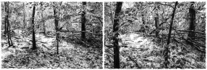
This is immediately followed in the book by Conor Stechschulte’s detailed renderings of a forest, one image per page (see above). These seem to be excerpts from his “Silence Country” work, where he drew from photographs taken every 3-5 steps of a walk through the woods (he’s also done a similar project as a minicomic/zine titled “Spirit World”). The images have a lot of depth and are vaguely haunting. Another great example of a walking comic (a genre including some of Porcellino’s work like “Psalm”, Oliver East’s Trains Are… Mint, and Taniguchi’s Walking Man).

Gazeta: Comics From Bangkok to Belgrade (some samples at that site) edited by Lisa Mangum and Maria Sputnik attracts for its international roster and more particularly work from Edmond Baudoin, Ron Regé Jr., Dylan Horrocks, and Amanda Vahamaki. I had high hopes for this anthology based on the international flavor, but little of it really came together for me. The Baudoin piece, even with my limited experience of his work, feels like something I’ve read by him before with unreal women, affairs, and chance meetings (though if you haven’t seen any of his brushwork, you should check it out). The Horrocks story is one I’ve already read on his website, making use of his imaginary Cornucopia country. The Vahamaki stories (two of them) have that nice pencil drawing style of hers but I don’t feel like the narratives are successful. The other pieces are often, to my tastes ugly, or narratively weak. The reason I kept this book around is for the Regé comics (see above), 10 pages (oddly missing from the table of contents) of the work he’s been doing lately adapting mystical literature (perhaps part of “The Cartoon Utopia”?). I don’t buy into the philosophical/theological content of the work but the way he illustrates it is fascinating. The content provides a great platform for Regé to mix his figural work with the abstraction and patterning that he is so skilled at. I expect there’s a book of this we’ll see at some point in the future, but in the meantime this is one of the bits and pieces that have been appearing in anthologies, mini-comics, and online.

I liked the dark and thick visual style of Portugese artist André Lemos (see above), but I can’t make much of the narratives. This is, I think, the case of an anthology where the hand of the editors is strong (they certainly are pulling from a wide swath of artists, which is admirable), strong enough that my lack of enjoyment of much of the anthology is caused by their tastes not matching up with mine. Which is to say, the work seems to be quality for what it is, but what it is is not for me. You may decide otherwise. It is good to see a new anthology in English that is not all artists from the U.S. or Canada, so I hope there will be future volumes of Gazeta.

Study Group 12 #4 is an anthology edited by the artist Zack Soto. What really got me to order this one is the appearance of Richard Hahn (see above). Hahn has an absolutely amazing comic in Windy Corner Magazine #2, and he doesn’t seem to be doing a lot of comics lately (he’s also in the Abstract Comics anthology), so I had to see his piece. It also helped that the anthology includes work by favorites Aidan Koch, Trevor Alixopulos, and Blaise Larmee.
Once again a lot of the work here was not to my taste. The cartoony grotesque style (as I’ve just decided to name it) of artists like DeForge, Vermilyea, Clotfelter, Cilla, Gazin, and Root is prevalent in a lot of the art, a style which I do not find aesthetically pleasing, but if you do, this anthology may be a lot more enjoyable for you.

Hahn’s short piece is not as successful as some of his other work I’ve read. It is drawn and paced well, but feels rather empty, almost like an extended gag. Koch’s piece is a good example of her short poetic work. Alixopulos’s three shorts (see above) are my favorite from the book. I find it hard to describe what it is about his work that draws me to it. His work teeters on the edge of an allegorical meaning, while the art combines a exaggerated and simplified cartoon style with great page design and a restraint that leaves enough unsaid to remain a bit mysterious. I’m honestly not sure what to make of Larmee’s piece which features his familiar girl character walking through hallways of what look like empty comics panels and then stopping to dance in front of an image of Charles Schulz.
The anthology is printed in an attractive purple color reminiscent of old “ditto” machine (aka the “spirit duplicator”) ink with a heavy silkscreened cover. I find the texture of silkscreen ink really unpleasant to the touch, something that always turns me off from work with these types of covers. Silkscreen is not really a tactile medium, and I find myself not wanting to hold this book. I can see the draw in making use of silk screening’s multi-color graphic qualities and its handmade quality, but it just doesn’t work for a book cover (compare the feel of a silkscreened cover, for instance, with one of Highwater’s publications which always used nice textural paper, and you’ll feel the difference).
Ghost Comics edited by Ed Choy Moorman is the only themed anthology of the bunch, its theme being, obviously, ghosts. The artists make broad use of the theme running the gamut from literal to metaphorical ghosts. There’s a lot of mediocre work in this anthology from artists I’ve never heard of and artists I am sometimes a fan of. What got me to order this book was the inclusion of Warren Craghead III, Aidan Koch, and John Hankiewicz. All three tend to work in a less-narrative more poetic form of comics that really appeals to me. There’s also a Porcellino page, but it’s a reprint from King-Cat (and found in Map of My Heart).

The three artists that brought me to the anthology, thankfully, deliver. Koch’s piece (see above) is a 7 page comic that has her normal use of pencilled drawings, textual narration in panels, and elliptical narrative with indirectly juxtaposed images. It’s also a little eerie with images of toothy mouths disconnected from any body and empty staring eyes. An interesting element of its construction is that you can see the ghost of other pages in the background of the photographic reproductions. I keep looking at Hankiewicz’s piece trying to figure it out and I just can’t. But I keep looking at it. It interestingly combines his more realistic hatched drawing style (like in “Amateur Comics”) with his looser and rounder style (as in the “Dance” comics).
A piece I liked from someone I haven’t heard of is a repeated sequence of a single image (once per page) by Jenny Tondera. The image sits small on the page and is accompanied by small amounts of text. Over the course of the pages the image fades in repetition to nothingness. It’s a quiet piece with an evocative textual narration which nicely fits the theme through the sequence itself.

The real star of the book, though, is Craghead’s 14 page “This is a Ghost” (see above). It’s drawn in a similar style to his How to Be Everywhere, precise pencilled images that sit on panel-less pages. The pages are lightly composed, averaging three images each with no real panels. Craghead repeats certain imagery, in particular a robed figure that looks like its head and shoulders have been edited out in a favor of a rounded top that brings to mind a child wearing a sheet as a Halloween costume. Hands reaches out from the robe. The text is slight, often repetitive. Craghead makes you work to read it by spacing out many of the letters, often to the edge of incomprehensibility. As a reader, you have to recreate the words, a process which slows down the reading, forcing attention, and setting a certain rhythm to the text. The words that are left whole read faster than those broken apart. The broken up words are also at times used to move the composition around the page and between the images. This use of text is reminiscent of concrete poetry more than traditional comics in this respective.
In a recent interview Craghead reveals that this piece is inspired by Giotto’s frescoes of the life of St. Francis, which confirms the vague religious iconography I thought I was seeing in the imagery. The hands reaching out from the robed figure often look like some kind of benediction is being offered. In one case the hands hold a chalice. The mixing of religion and ghosts adds to the potential readings of the work. It’s a beautiful piece, worth reading and rereading, and on it alone, I’d say: “go buy this anthology.”
A few comments from the original post at The Panelists:
Charles Hatfield:
Derik:
I mentioned the economic aspect a bit, I thought, though not that explicitly. It was only after I wrote this, that I looked up at my shelf and all the Mome volumes I have. I was reading it for quite awhile but finally gave up as I realized how much the editorial tastes were not very closely matching with my own (ditto Papercutter, come to think of it). The pieces I really liked were not enough to make up the price, especially when so many seemed destined to collection at a future time (at least in the case of Mome).
I think I agree with all your points. I would be interested in a shorter, regular anthology, as I noted, sometimes the size of these anthologies works against them, the more work there is, the more mediocre/bad work there is. (Which was my point about Windy Corner and it’s shorter, less contributors, format.)
Oh, and in regard to editorial demands and not paying. I’m not even thinking about editorial in regards to feedback/editing, I’m thinking of editorial more in the form of curation, which would probably be a more accurate term for what goes on in (almost?) all these anthologies. The editor is selecting work to include. I want to see a stronger hand in what gets selected. If artists are only going to make decent work because it’s a paying job, then they aren’t going to get very far at making comics (or any art).
Noah Berlatsky:
Curation is tricky too though I think. Artists don’t always do their best work, sometimes you take a chance on someone and it works, sometimes it doesn’t…if you’re not in a position to cut work you don’t like, things are going to be a bit catch as catch can, no matter what curation work you do up front….
Derik, it sounds as if you discovered a large handful of fascinating comics through these anthologies, and that right there presents a strong enough argument for them. I know I’ll be looking out for some of the works you mention, thanks!
It’s not easy to bring together a bunch of comics by different artists and get them to be a fairly consistent read.
One factor, of course, is economics. In the notoriously under-supported, under-capitalized fields of alternative and avant-garde comics, strong editorship is often impossible because the editor/publisher cannot afford to make demands of the artists. Simply put, in the gift economy of small-press comics, most often you have to take the bad with the good, because (a) you can’t reasonably make substantial editorial demands on artists whom you can hardly pay; and (b) the ethos or ideology of the scene favors openness, which I think is to the good even though many of the resulting comics are not worth remembering (the chaff to wheat ratio is high, but devotees tend to accept this as part of the cost of supporting what we hope is a vital, nurturing scene).
Paeans to alt-comix anthologies like Kramer’s neglect one problem, though, which is that such sporadic anthologies don’t fulfill one of the traditional roles of the anthology magazine: supporting creators by offering a regular, predictable, periodical outlet for work. Were there a regularly-appearing anthology with enough strong content to outweigh the weak (Mome may be the closest thing now, or perhaps Papercutter), I’d gladly subscribe as a gesture of support.
In some ways the old, magazine-format Drawn and Quarterly anthology, the original run, came closer to what I think an anthology should do than did the later, frankly handsomer Vol. 2 and Vol. 3. It provided an outlet for a lot of young artists and was a bit less forbidding as an object.
It’s rare that a sporadic publication, a la RAW, can generate the kind of excitement and cohesion that a solidly monthly, bimonthly, or quarterly outlet can.
All that aside, I really appreciate this post.