The Comic Strip Art of Lyonel Feininger

The Comic Strip Art of Lyonel Feininger. Edited by Bill Blackbeard. Kitchen Sink, 1994 (out of print). 55 color p., 10.25″ x 13″.
Of all the “Masters of American Comics”, Lyonel Feininger is clearly the least well known. Who is this artist placed between Winsor McCay and George Herriman? He’s best known as a “fine” artist, having taught at the famous Bauhaus school.
His comic strips are found complete in the 55 pages of The Comic Strip Art of Lyonel Feininger (and the first strip doesn’t appear until page 9). They consist of 29 full-page strips of “The Kin-der-Kids,” spanning 5/6/1906 to 11/18/1906, and 20 strips (all but 4 are full-page) of “Wee Willie Winkie’s World,” spanning 8/19/1906 to 2/17/1907.
“The Kin-der-Kids” tells of the adventures of a strange group of children: Piemouth (a chubby kid who loves to eat), Strenuous Teddy (very strong, a Teddy Roosevelt caricature), Daniel Webster (the smart one), and their companions Sherlock Bones (a dog) and Japansky (“the clockwork waterbaby” (don’t ask, I have no idea, some kind of robot)). They set off from America in their bathtub and get into some adventures on the sea, and in England and Russia. All the while they are being pursued by Auntie Jim-Jam and Cousin Gussie, who dress in dark colors and resemble a nun and a pilgrim. The Kids are also aided by Mysterious Pete, who floats on a cloud and is almost completely hidden in a long cloak and large hat (though his pants appear to have a red fringe on them).
Probably needless to say, this is a weird story that fits in well with the dream narratives of McCay and the abstract fantasy of Herriman. Unlike those, The Kin-der-Kids is much more a continuous narrative, that would make even less sense out of sequence. The strip ends prematurely (cancelled) without getting any real idea of where it was headed (or really, what was going on). Many of the stories have a surrealist quality to them that makes for a few very crazy sequences.
“Wee Willie Winkie’s World” shows us the world through the titular character, a small boy who resembles a short old man wearing a schoolgirl dress and a wide-brimmed black hat. Willie sees the world as an anthropomorphized wonder: clouds come to life as marching soldiers; trees smile; houses have faces; pIles of hay appear as stooped-over women. Each strip is Willie observing some new wonder of nature meeting imagination. While “The Kin-der-Kids” uses McCay-esque cramped word balloons, Wee Willie is narrated by boxes of small typeset text. The narration suffers from the similar problem of many early comics, telling too much that is already clear from the images. Willie is also much closer to “Little Nemo” in its breakdowns. The strip has many transformative sequences, where something changes in appearance across a series of panels or where something moves only slightly across the sequence.
Like McCay and Herriman, Feininger’s pages are also immediately striking for their layouts. He often uses very large panels, sometimes having as few as four panels to a single one of his large pages. What sets Feininger’s pages apart is his use of decorative elements at the edges of the page and in between panels. He starts out by simply cutting off the corners of panels to create interesting negative spaces in the gutters.
Further into “The Kin-der-Kids” red rectangles, squares, and triangles, start appearing between panels, either sitting in the gutters or overlapping the edges of a few panels.
By the end of the “Kids” he is using more irregular groupings of shapes. In all cases Feininger retains a symmetrical design and layout to his pages.

(One-third of a Kids strip, note design elements at edges and really weird contraption in panel.)
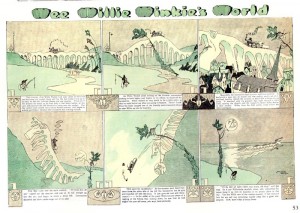
On the pages of “Wee Willie,” abstracted objects and figures (jesters, cats, trees, clocks) are used on the pages. Interestingly these elements rarely relate directly to the story on the page. Much of the designs have the appearance of a flat bas-relief (a few of the heads even look like something out of mythology found on an Ancient Greek temple). In all but a very few pages he retains his symmetrical designs.

(One-third of a Wee Willie strip, note design elements at edges and center, also symmetry.)

(One-third of a Wee Willie strip, note design elements at edges and center with medusa-like appearance, also symmetry.)
The colors in “Wee Willie” are, even in reprint, beautiful. Like McCay there is a clear sense that Feininger was involved with the coloring process. The subtle use of color tones and gradations looks like watercolors. The last few pages of the strip are in various monochromes which are amazing.

(Full half-page monochrome Wee Willie strip)
Feininger’s drawing has a peculiar angular quality to it. His clouds and waves (two things I’m always trying to get right in my drawings) are just beautiful. The clouds are towering and bilious, the waves almost icy. (See cloud image above.)
As impressive as Feininger’s art and design in, I still never warmed to these strips. “The Kin-der-Kids” seems to start in the middle and never pulls together for me in any way. I was never completely clear on what was going-on on a larger scale (what are those kids doing travelling around in a bathtub, what’s the deal with the clockwork waterbaby). “Wee Willie,” on the other hand, is more like a children’s poem strip. It’s extremely repetitive (those anthropomorphized clouds, sun, and trees just keep coming back) and all too charming in a children’s book way. But perhaps it is too much to hope for a great artist and a great storyteller at this point in time where comics are still being formally created as their own entities. It would only be later that we would see more brilliant artist/writers who excelled at both.

