Prince Valiant: An American Epic

Prince Valiant: An American Epic, Vol. 1 1937 by Hal Foster. Edited by Rick Norwood. Manuscript Press, 1982. 17″ x 22″. $150.00
(My previous post on Valiant has gotten a lot of hits lately, so this should make some people happy.)
A few months ago I linked to an image of someone viewing original Prince Valiant art. Those pages made my Fantagraphics volume look so small. With a little searching I discovered Manuscript Press’s three volume edition of the first three years of the strip printed at 17″ x 22″ size. The books themselves were published in 1982 but are still available (see the link above) at the unfortunate price of $150.00 each.
I spend a lot of money on comics but that’s a lot for one book. Interlibrary Loan came to the rescue and a copy was delivered to me at the library from elsewhere. Actually seeing this book in the flesh is… well it’s huge. I read this in bed before going to sleep and the book makes me look like a kid thanks to the unusual change of scale.
This volume reprints the first 47 episodes of Prince Valiant, dating from 1937. The quality of reproduction, color, and paper is amazing. You won’t see the strip in this kind of quality anywhere else (perhaps that new “Little Nemo” book which I have yet to see). You won’t see many strips at this quality, it is evidently quite costly.
This is the beginning of the still ongoing epic of Prince Valiant, and we first see him as a children. The King of Thule (Valiant’s father) and some of his followers are fleeing his “merciless enemies” (why? I have no idea). They take to sea and then back to land where they tussle with the Britons, eventually making peace and settling on an island in the fens where Valiant grows (zoom through time in as few panels as possible). An old witch he finds in the fens foretells his lack of future happiness (though from what I’ve seen of future installments he does okay). He leaves the fen, runs into Lancelot (who mostly ignores him) and then meets and joins up with Sir Gawain. Camelot follows with a brief look at the luminaries there. Adventures follow with knights, princesses, castles, fights, deceitful nobles, and even an ogre. Oh, and ducks. They often get shot and eaten, but Foster’s drawings of them are excellent.
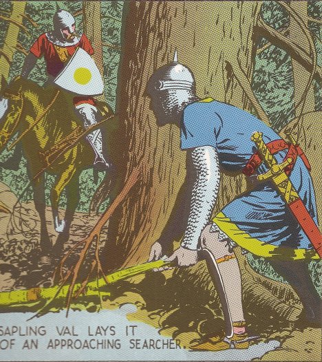
The stories aren’t quite as interesting as later episodes I’ve read, but Foster was just establishing his character and the world. Obviously the real reason to read this book is for the extra-large sized art. Foster’s drawing skills are already fully-developed, and the size of these reproductions allow you to see every line and swath of black. You don’t see many comic artists anymore that have such a realistic style, which, accompanied by the research Foster put into the strip, makes for a convincing world and a beautiful page
Here’s an actual size image of 2/3 of a panel that is 1/6 of a page (sorry it’s a little blurry, the book doesn’t exactly fit on the scanner with any ease):
Reading the book, I noticed how predominant Foster’s use of full-figure cropping is. He rarely shows us less than the whole character. Because of this his compositions rely heavily on mid-ground and background. (A good contrast would be an average Kirby panel with a cropped foreground character, a mid-ground character, and small background characters.) This puts the reader at some distance from the goings-on, but also forces Foster to spend more time with backgrounds and settings. Thus, he more fully paints the world.
The page layouts show a great variety. Varying from as few as four to as many as twelve panels on a single page. This seems as much an element of story pacing as visual design, though it serves both, allowing him to advance the story as little or as much as necessary (and one sees examples of pages that happen in moments or days).
One interesting layout uses a regular twelve square panels, except for one central panel (often the fifth or eighth) which is larger than the rest, expanding evenly on all sides to cut off the corners of its neighbors. The slight alteration of size, and more importantly the space that is taken from the other panels, provides great focus on this enlarged panel. It’s a effective device that I haven’t seen before (that I recall).
The color is reproduced to maintain the original four color process dots, which allows the strip to retain a certain historical appearance.
I only have two volumes of the Fantagraphics reprints of Prince Valiant, one is rather muddy, the other less so, but one can’t appreciate the fine art (particularly the inking) as much at the smaller scale. If you can find a copy of these volumes (or have a lot of money to spare) they are worth looking at.

