CHRZ
CHRZ by Stefan J.H. Van Dinther. Belgium: Bries, 2005. 64p. 18 Euros (I paid $19 at MOCCA).
I’ve read Van Dinther’s album CHRZ a few times now and I can’t tell you what it’s all about. That I keep rereading it despite my confusion is a testament to the visual invention and graphic force of the work. Van Dinther has a diagrammatic, filmic approach that he combines with innovative page layouts and a concise direct drawing style.
The story has the feeling of being constrained. The settings, characters, and objects are severely limited in scope. The whole story has a surreal, dreamlike style: sex, violence, strange juxtapositions, minimal settings, hazy connections. It’s also completely silent. The beginning of the story shows a giant hand (God?) pulling a fly from a flower and setting it off on a journey down from the sky to a group of buildings. Through the eyes of the fly, we see the settings and characters. Van Dinther uses honeycombed panels to replicate the multiply lensed eye of the fly. We first see the honeycombs as simple moment-to-moment panel transitions as the fly flies about, but a page later the effect is used to show the same object or character multiple times in a small grouping of the panels. This shifting from a close following of events to a multiple perspective approach is used often in the comic, not just from the fly’s point of view. The use of multiple perspectives is where Van Dinther gets most inventive in his layouts and narrative breakdowns.
In one section we see panels of a woman watching the fly as it flies into her companion’s ear. Running on the rows between those panels are honeycombed panels showing us the fly’s perspective of the same situation.
Panels are often grouped together on the page. One page has ten rows of panels grouped into five groups of two through the use of an extra wide gutter after every second row. The panels are all the same width, but the top panel in each grouping is shorter. The top panels all follow a woman, who is kept in the top room of a building, as she picks the lock on her room and collects a book from the bookshelves on a lower level. The bottom panels in each group show the two men, who seem to be keeping her there, leaving that same building and going for a walk into the country.
Another interesting section shows four different simultaneous perspectives on across a two page spread. The top of the pages shows the woman in the top room reading a book, watching as the fly approaches her. The second row of panels shows us the honeycombed perspective of the fly looking at the woman. The bottom (fourth) row shows the man and woman who are in an opposite building. The man is making sexual advances on the woman, but the row above this (third row) shows his thoughts (he is thinking of the woman in the other building). His companion seems to be able to see his thoughts and rejects his advances. In a narrative symmetry, the fly’s perspective goes dark as it is smashed between the pages of the book by the woman, while the man’s thoughts go dark when his companion punches him in the face (her rejection of his advances).
(Click to see a full page. Warning: Abstractly illustrated sex.)
The man’s thoughts in this section are themselves done in a sequence of panels, creating an imbedded panel grouping, not something one sees very often (but filled with possibility).
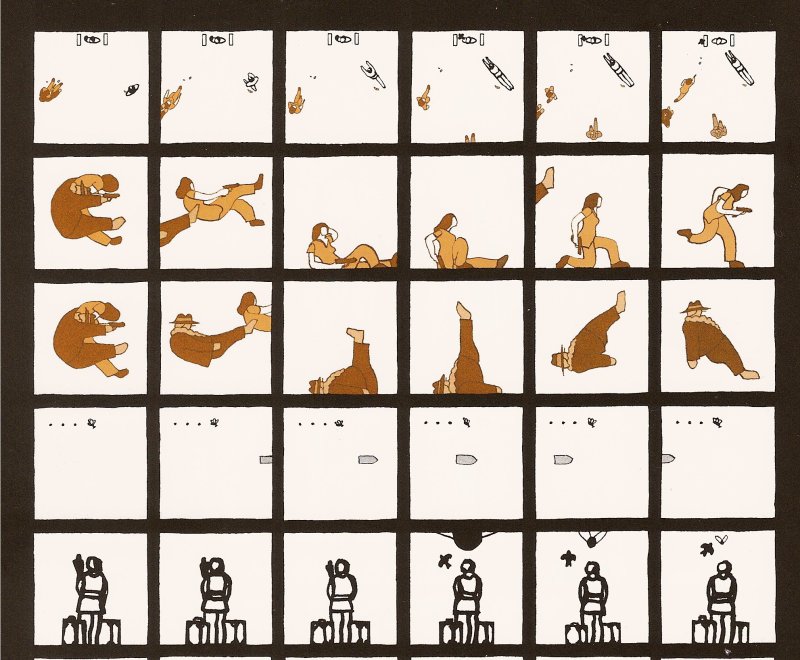
In a later section, a two page spread is covered with 108 square panels in nine rows. Each row shows us the same events focused on a different character or object in the scene. The first row shows the events from above, while subsequent rows focus on each of the other characters. Another row follows the movement of a bullet, another a knife. In this way we piece together the whole event from numerous perspectives, an almost narrative cubism.
Van Dinther’s art is very simply rendered, mostly outlines, little shading or even detail, with a thick, mostly unvariegated line. The one building and its inhabitants (the woman locked in the room and the two men) are all drawn in browns and oranges, while the other building and its couple are drawn in black and grey. At this point I have no explanation for this. The pages we see from the book the one woman reads have a crowded and flat composition that is reminiscent of medieval style illustration.
Most of the panel transitions are moment-to-moment, giving the book the occasional feel of stopped animation or film (which you can see in some of the examples above).
A mysterious and fascinating graphic novella.


