Panels & Pictures: Text

Many definitions of comics have some focus on the interaction of text and pictures. While I've said enough about definitions, I would like to write a little bit about text in comics. How is text used in comics? Comics without text are unusual enough that they have their own name: "silent comics" (like silent film) or "wordless comics" (in France they use "muette"). This month, I'm going to make an illustrated list of different uses of text in comics. A number of these items will be familiar and are ubiquitous in comics; I think a few will be unusual and perhaps inspiring. I make no claims for exhaustiveness, nor is my list structured in any way. Suggestions are welcome in the comments.
For concision's sake, I found this image by Jack Kirby (Strange Tales #114) (above) that contains three of the most common uses of text in one single panel (you don't see that much): text as speech, text as interior monologue, text as narration.
1. Text as Speech
Text as a representation of speech (whether in balloons or not) is almost (but not quite) essential to comics. A host of visual idioms have developed over the years to mark text as speech text. The most common is the word balloon, usually with the accompanying tail that links speech to speaker. Often the balloon is omitted but the tail remains as a simple line pointing from text to character. Text placed within the panel like this has a certain immediacy to it as a part of the visual image, existing within the same space as the characters/objects/settings.
A less common approach is placing the text outside the panel. The example from Kyle Baker above (thanks for Frank Santoro for posting this image the same day I needed a good example) is an interesting example where the text is placed beneath the speaking character. To me this feels more distant than a word balloon. As if we are reading a transcription of a conversation that already occurred. Dave Sim uses the transcription/play style dialogue rather frequently in Cerebus, marking off changes in speaker through textual notations of the character's name.
Most speech text in comics is done with a consistent look and style throughout. Bolded text (see that Kirby panel again) is used for emphasis and variations in letter size are also commonly used as an indicator of volume. Occasionally (perhaps most famously Todd Klein's work on Sandman) special fonts are used for certain characters, providing their speech with a distinctive, yet still consistent style.
Probably the most dynamic use of speech text in any comic is Dave Sim's work in Cerebus (there's a reason I mention him a few times in this column, he is a master of text in comics). Sim treats the text as images, altering their style and layout as necessary to produce narrative effects (see above for a simple example).
2. Text as Interior Monologue
Words used to represent interior monologue is not quite as common as words for speech. This has traditionally (though now rather out of vogue) been shown inside the scalloped thought balloon with a series of circles linking text to character. Unlike the previous use of text, we do not read this as audible sound within the panel. This usage can often overlap with the next one, as interior monologues can be treated as narration. This particular usage (thought balloon style) is more often a less consistent use of interior monologue — the thought balloon may appear for a character in only single panel or in a number of non-contiguous panels throughout a story. These will also tend to be used for numerous characters often at the same time (in the same panel), while an interior monologue narration will tend to stick to one character for a whole work or for a longer section of a work.
3. Text as Narration
Frequently overlapping with the previous two items is the use of text as narration. While the above two are used to represent speech/thought that exist within the visual space of the panel, narration is often displaced from the visual image by either time or space. That is, the narrator may be speaking from a place outside the normal space of the narrative, such as someone telling a story that happened in the past (see the Kevin Huizenga image above from Or Else #3) or a narrator that exists outside the story (like the classic Marvel narration of Stan Lee seen above or the oft-used narration of time/place indicators "Later" or "Back at home").
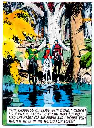
Variations include the text as caption to an image such as Hal Foster used in Prince Valiant (below).
4. Text in an Image
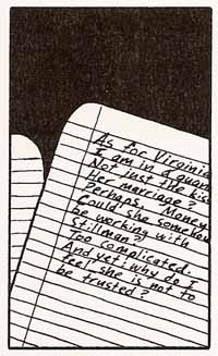
Text is also used as part of an image, a detail in a representational image such as a sign (see the Jaime Hernandez panel below), text on a t-shirt, or even text on a letter within the panel (the David Mazzuchelli panel below). As opposed to speech, thought, or narration we read this text as part of the represented space/objects even if, in some cases, the text is read as narration (like the Mazzuchelli panel).
You sometimes see this boundary broken in comic strips that make a joke by having a character interact with her word balloon or using some other metafictional trick (like the Ernie Bushmiller panel below).
5. Text as Sound Effect
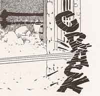
Sound effects have a long history of use in comics (which would make a great study), serving as a representation of non-speech sound. Sound effects are one of the most common places the appearance of the letters/words is used to create meaning in comics.
Most sound effects are onomatopoetic but text can also be used to describe or label a sound rather than to recreate it. Porcellino's image below goes beyond the normal onomatopoeic use (i.e. “thwup”, “crash”, etc.). Instead of trying to recreate the sound, he uses words to describe the sound. In the panel, the word "tune" above the guitarist's head evokes the participation of the reader's experience to hear the noodlings and repeated tones of a guitarist tuning his instrument. This would be extremely difficult to recreate with traditional sound effects.
6. Text as Smell
In a similar vein, Hope Larson here (in Gray Horses) uses words to describe a smell. It's hard not to call this a "smell effect", with curly lines that seem to represent the wafting of the smell through the air. As far as I've seen this is an extremely rare use of text in comics.
7. Text as Label
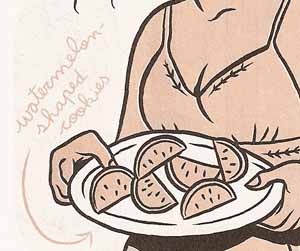
Larson also uses text as a descriptive label for an image in a panel. The cookies in the panel belowe would be extremely ambiguous — is it fruit? — were it not for the accompanying text.
8. Text as Modifier
Frank Santoro uses text as a kind of modifier to the image. See the panel below (from Cold Heat) where the text works to add description to the image (Huizenga does this, too).
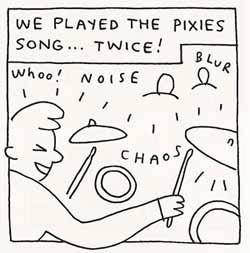
The second panel, by John Porcellino (King-Cat #65), uses a similar tactic. The words "chaos" and "blur" are neither sounds nor narration nor part of the represented scene (those words aren't objects floating around the room) but a textual adjective added to the visual image. While the panel would be identifiable without these words, they add atmosphere to the scene. It could be argued that if he wants to express these ideas, he should make the drawing represent these qualities, but as comics are already a mixture of words and pictures, these tactics fit perfectly. In a way, this is an even further mixture of words and pictures. If one recalls McCloud’s pyramid of drawings, Porcellino’s drawings often sit right on the line between the iconic image and words.
9. Text Blocks
Another, fairly uncommon use of text is the long "text block" most (in)famously used by Dave Sim in later issues of Cerebus. The example below from Jaka's Story is a short example.
This use of text in a comic is one area where many readers will (have) say that it is "not comics." While this does veer towards illustrated text, Sim's use is only a small part of the larger work and tends to serve a very specific function in Cerebus. A great majority of his text blocks contain text that is in itself text within the narrative (in content if not visually like the Mazzuchelli image above). In the example above, the text is part of a written story by Sim's Oscar Wilde pastiche (seen in the image). As we see him working on it, we read the text itself. In many cases large text blocks like this are just extended forms of the narrative captions (such as M'Oak does in Thieves & Kings). A good way to get out a lot of narrative in one fell swoop
10. Titles, Credits, Etc.
One should not overlook the use of text as part of paratextual apparatuses such as titles, credits, and end markers ("The End" or "To be continued…") Titles and credits are most often seen in pamphlets and anthologies as opposed to longer volumes. Will Eisner is deservedly famous for the inventive use of titles in his Spirit work (see below).
A wide ranging survey of the appearance and use of credits in comics might be of some historical interest, but I'll refrain from any examples here. Ten seems like a good round number to stop at. Just making this list has got me thinking about text and will surely cause me to pay a little more attention when I read my next comic. I hope it will do the same for you. (All images copyright their respective owners.)
[Originally published at: http://comixtalk.com/panels_pictures_text_comics]


