D+Q Showcase 3

Drawn & Quarterly Showcase 3, Featuring: Geneviève Elverum, Sammy Harkham, Matt Broersma. Drawn and Quarterly, 2005. 96p, $14.95.
I’ve been real hit or miss with these Drawn & Quarterly Showcase annuals. Some artists I really like fall flat on their contributions. Jeffrey Brown’s part of the first volume felt like a bunch of half-formed strips scribbled off in a few moments, and Kevin Huizenga’s story in volume 2 left no impresssion on me whatsoever (thankfully by the time Or Else was solicited I had forgotten about his story and ordered the book based on a few online strips I found). And it probably doesn’t say much that I don’t remember any of the other artist involved.
Well, this time the inclusion of Sammy Harkham made me pick this up. I really enjoyed Harkham’s sailor story in Kramer’s Ergot 4, less so his story in Kramer’s Ergot 5. I haven’t seen any of his other work, so this was an opportunity to see something longer. I was not disappointed in the story, “Somersault”, included here. For me, it was the stand-out work, the one that makes this volume worthwhile. Harkham’s story consists of short fragments of the summer day-to-day life of a teenage girl named Iris (about 16 years old, I think). She has a kind of boyfriend, a secretly gay brother, a best friend whose brother recently died, and a friendly neighbor. She gets drunk, swims, walks around, sits around… There’s no real narrative drive to the story, it’s just quiet fragments. Such a structure could go horribly wrong, feel pointless or boring, but the beauty and subtlety of Harkham’s work makes this succeed.
On the subtlety, while in many artist’s hands the best friend’s loss of her brother would be a major plot element, discussed, emoted, the effects of it on the friend dealt with explicitly. Harkham treats it as many teenagers would. There’s no real discussion (we learn about it from the protagonists’ mother), instead we see the girl constantly wearing her brother’s old, beaten-up sneakers. Those sneakers are a quiet memory of the event. Her mother gets her new shoes and one night she throws them off a cliff into the sea.
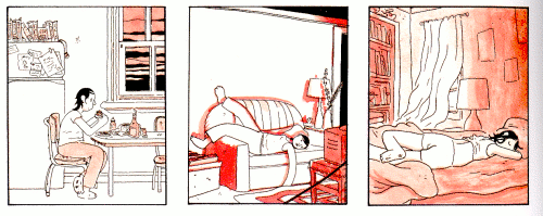
The artwork is done with thin black lines and washes in various shades of peach. The characters are all rather bulky and bendy while the backgrounds are more realistic. Harkham uses a number of old comic conventions: when Iris and her friend get drunk little curly-cues and stars appear above their heads. It’s all really wonderful drawing/cartooning. He fits a lot of information into the small panels.
The pages all keep to a steady 9 panel layout that is unwavering. Each moment is of the same size, everything becomes equal. Harkham never breaks the pattern; no event becomes more important than the next. Here’s a sample of one of the strips (click for a larger, better scan):
I’m eagerly awaiting Harkham’s forthcoming “Crickets” series from D+Q.
Geneviève Elarum’s colorful artwork is quite beautiful. It has a slightly asian appearance to it. Her story “We’re Wolf” begins with a 4 page sequence of a girl writhing around on her bed talking about depression. She hides her face in her pillow, the book she was reading falls to the floor, then an elephant comes out of her throat. She sees it out the window being ridden by a boy and goes to ride along with him. They ride and a red string, as if she were flying a kite, trails from her up into the sky (off the page). They leave the elephant and he dies. From there the story gets the girl and boy into the mountains where the boy disappears (well he just stops appearing in the story) and the girl has a brood of children that inexplicably (to me, at least) say “We’re wolf”. The End.
I can’t make much sense of the story. It seems disjointed in a way that I can’t find the connection, but the art and the layouts are nice for looking at. Elarum excels at tightly controlled movements between almost identical panels, such as the depression in bed scene, or a two page spread in 12 panels where she sites in a cave and her children appear inside her sleeping bag.
Matt Broersma’s story is in two parts. It first tells of a ghost who gets a lounge singer to find and burn his murdered body so his spirit can be released. The second part goes back and tells the story of his murder, though focused through a peripheral character. The whole thing looks much like a bande dessinée. The layouts stick to two or three strips across the page (2 in the first part, 3 in the second part). The art too, in blacks, gray washes, and shades of olive green, looks European. The color scheme creates a feeling of the past, drab and grey like an old movie. I was rather bored by the story.
