Deborah Turbeville: Past Imperfect

This post originally appeared at The Panelists on February 7, 2011.
In a continuing series of posts on works that might not be comics (but, then again, they might be), but are in some/many ways fall into the same family. Series title still pending…
Back in March of 2009 Domingos Isabelinhos posted the “Anthologie de la Bande-Dessinée” from the French comics magazine Dorénavant, edited by Barthélémy Schwartz and Balthazar Kaplan. Their anthology is decidedly outside what just about anyone else would come up with. It included a number of works from the fine art world that would not be considered comics (Andy Warhol), those clearly influenced by comics (Keith Haring), and a few works conventionally considered comics (Verbeek, Swarte, Fred, Pratt). One of the names that was unfamiliar to me on the list was Deborah Turbeville, who occupies three of the thirty spots on the list.
A little research (more than usual though, as — a rarity these days — there is no Wikipedia article on her (which I must attribute to the fact that she is a female photographer working in fashion, a crossing of areas in which Wikipedia does not excel)) taught me that Turbeville is a photographer who has been working since the 70’s. She started out as a fashion editor and like many photographers works both in the gallery art world and for fashion magazines. Her works are figural and often narrative. She at times mixes text with images and lays out her photos into multi-photo conglomerates that bear a clear resemblance to a comics page.
The book I have, Deborah Turbeville: Past Imperfect (1978-1997) (Steidl, 2009), covers series of works from two decades. It’s an unusual volume, not your traditional art monograph that has essays and metadata on each image, instead the photographs fill the book with almost no commentary (except a few reminiscences by Turbeville herself). Even differentiating one series from another becomes a bit tricky when titles seem to be interpolated at the end or in the middle of the series.
Rather than attempt to discuss the whole book, I thought I’d look at a few pages from two different series. This first page is from the “Glass House” (1978) series, at least I’m pretty sure it is. It’s the only part to feature this man, but is preceded and followed by photographs featuring the same women in the same glass house.

The Glass House (1978), fig. 1
This is most of one page from the book (the book’s just a tad too big for my scanner) and is juxtaposed on the left by a single large photo, which I believe is just a blow-up of the image in the center of this page. Part of the ambiguity of this volume are these larger images, sometimes they appear to be the same as a photo on an accompanying page, perhaps to act as a detail, sometimes they seem to be purposeful repetition as part of the series. Turbeville does use repetition frequently throughout these series: it can be seen in this page where the upper right and lower left images appear to be the same photograph printed differently.
I’ll assume the visual connection to comics is obvious here. Based on the collaged nature of the photographs and the ground upon which they are placed (tape, pieces of a dress/clothes pattern), these images are meant to be seen this way. That is, it is not a juxtaposition created for the purposes of publication (i.e. an art book where a few images are placed on a page to conserve space). Turbeville has grouped these images in a specific order to create some narrative sense.
The narrative that evolves on this page is narrative at its basest level: this then that; time passes; change occurs. But there’s no direct story as such. The man walks through the overgrown vegetation, apparently from a house (seen in the background of images 2, 4, 5, and possible in image 1) to the glass house in the last image. The page ends on an moment of expectation, an open door, a beat. Hergé placed those moments at the end of a page in his Tintin comics to create suspense for the next page, but here any suspense is deflated, leaving the reader with ambiguity and mystery.
The turn of the page finds a large image of two women (seen in previous pages) in the glass house. The man doesn’t appear again, though in the pages/images that follow I can perhaps detect some kind of grim tale playing out.
The following spread includes five images. First we see the two women (who are the primary subject in the pages preceding the above example) in the glass house. Then we see then in close-up looking towards the camera/viewer, as if confronting another person. This is followed by three images showing them slumped on top of each other on some kind of counter running along the wall of the glass house. End sequence.
The man doesn’t appear again, though in these subsequent pages/images I can create a grim tale playing out. Does this man represent an intruder, some kind of killer (note the close show of his hands, above, perhaps a strangler) who does away with the two women in the glass house? It’s not clearly so, but it is one possible interpretation.
As with many other marginally comics-esque works, I find myself “reading” these images as I would a comic, in a left-to-right top-to-bottom order. That’s how I generate the above described narrative. But is that necessarily the way to view this page? I don’t know. Once I’ve built this narrative I find myself hard-pressed to diverge from it. I can’t deny that the pages, at least, ask to be read in order, as a sequence. Unlike “Magic Forest” there are repeated characters and backgrounds, so I feel the need to form those repetitions and variations into a time-ordering.
The next pages are from a later series, that are not identified in the book, but the website for the exhibit this book is based on labels them as “The Staircase” (1980):

The Staircase (1980), a page from the book, fig. 2

The Staircase (1980), a page from the book, fig. 2
This series featuring two (or more?) women in a circling stairwell. Once again the structure of their grouping points to an unified composition. Interestingly enough, I find myself less able to “read” these pages as ordered than the previous example. While there are clear repetitions of character and setting, even repetitions of the same image (first page third image and second page eighth image are the same image printed in reverse and negative), the image to image connections are less direct and orderly than in the first example. The viewpoint jumps around, the characters act in a less direct way. Here there is less in the way of narrative. Turbeville is creating atmosphere, more so than linear narrative.
On the exhibit website I found this image that shows one of the above examples (fig. 2) in a slightly different version (perhaps how it was shown in the gallery):

The Staircase (1980), a image from the exhibit, fig. 4
While most of the images are the same, a few are different between the two versions. The fifth image in the book version seems to be pasted over the image in the gallery version. This points to a fluidity in how Turbeville lays out these works. They are not fixed creations but in some amount of flux. One could easily imagine taking all these same images and putting them in a completely different ordering.
Again, similar to my first example, when placed in spreads, there is a large image repeated opposite these groupings:

The Staircase (1980), a spread from the book (including fig. 2), fig. 5
The large recto image is a blown-up copy of the image just left of it in the middle of the verso. The woman’s face is ambiguous though she appears worried or apprehensive as she looks back over the other images.
I find these up and down stairs images quite evocative. There is something mysterious about them, and also a sense of morbidity. A veiled woman in black appears a few times (clearest in the eighth image of the first page), suggesting mourning. The women seated on the stairs are in an in-between place, neither here nor there, up nor down, at one point seen as if spying between the balusters to somewhere below, like children watching their parents late at night after they’ve been sent to bed. The image in the lower right corner of fig.3 has a fantastic appearance. The central woman’s head and neck seem curiously distended, as if her head is almost floating off her body or her neck was replaced by a ceramic vessel. The large image that accompanies this page on the verso side of the spread shows a woman on the stairs who looks as if her face were carved in stone.
Turbeville alternates between cropped close-ups and medium-long shots, making it hard to connect the faces to the bodies. How many women are there in these images? At least two, but perhaps three or four. The tightly cropped close-ups of the faces also add to the tension of the images.
The images are grainy, blurred, printed too dark or too light (for conventional standards), defeating any easy examination of the details. They evoke the poorer technical quality of the photographs of decades (or a century) earlier. By doing so, the images become less the object of individual scrutiny and work better as parts of a whole. They take on a stylization, a certain level of abstraction, a hazy atmosphere.
More than anything else, these images are about the atmosphere and evocative feeling, often a sense of darkness and mystery. They are not exactly full narratives. They are not exactly descriptive: the style defeats any inclination to really see the people, the clothes, the objects, the rooms or buildings. They are more in the realm of the poetic, where the repetition and juxtaposition of visual elements builds meaning. A number of these works appeared in various Vogue magazines (Italian, French), and it makes me wonder about the narrative elements of fashion photography (a subject which I know nothing about).
The way she combines the photos and the way they are printed foregrounds the physicality of the photographs as objects and the process involved in their creation. The pins, clips, and tape manifest the contingency of the sequencing. These images are not like a film of quickly ordered time. They do not hide the editing, rather it is made quite clearly exposed. By printing some of the images with the sprocket holes and frame numbers showing, not only do we clearly see the origins of these images as photographed images, by we can see the way the images have been juxtaposed in a different ordering than they were taken. Note in the second example how the first image is frame 13, the second is frame 2, the third is frame 26.
Unlike Mark Laliberte’s visual poetry, Turbeville’s work bears no connection to the cultural product that is comics (unless (doubtfully) there were some early influence, as Turbeville is old enough to have been young at a time where there still were comics targeted at girls). Yet, if we think of these pieces in relation to comics, they offer an example of a path little trodden, both narratively and visually. I can see some relation in the works of Aidan Koch which are often semi-narrative and atmospheric, focusing on figures and scenes. In some sense these works also bear some resemblance to the works of Mat Brinkman, where strong narrative is foregrounded by environments, figures, and strong stylistics, though Turbeville is much less linear in her narrative structure. In the way she pushes forth the work as object and process though, these pieces are very much outside most comics work, though Jason Overby has made some pages that push in the direction of a collaged object moreso than a printed work.
A few comments from the original post at The Panelists:
Andrei:
Derik:
Thanks for the leads, Andrei. Looks like Droit de regards was just rereleased last year by Les Impressions Nouvelles (who also reprinted some of Vaughn-Jones’ work and Peeter’s book on the Castiafore Emerald).
Greice Schneider:
Together with Le Droit de Regards, Les Impressions Nouvelles also released a book about narrative photography (including analysis of works by some of the authors you mention, Plissart, Calle, Snow..).
http://www.lesimpressionsnouvelles.com/catalogue/pour-le-roman-photo/
This atmosphere you mention, specially in some close-ups (but not the page layouts) also reminded me of the book with the still images from La Jetée (Chris Marker), that was published as a ciné-roman.
Charles Hatfield:
…the images become less the object of individual scrutiny and work better as parts of a whole. They take on a stylization, a certain level of abstraction, a hazy atmosphere… More than anything else, these images are about the atmosphere and evocative feeling, often a sense of darkness and mystery.
I’ve tried in vain to trace a connection — an influence — between Turbeville and Dave McKean, precisely because the above passage made me think of McKean, specifically of collage-dependent works such as Violent Cases and Mr. Punch (to pick two of McKean’s many collaborations with Neil Gaiman). Certainly the level of stylization, abstraction, and atmospheric haziness seems similar, though of course in the works I’ve mentioned the narrative through-line supplied by the scriptwriter (Gaiman) makes those works less open to interpretation than your Turbeville examples, and McKean, especially once he became reliant on digital collaging, seems to foreground the physicality of the collaged material less than Turbeville does. But I wouldn’t be surprised if McKean had seen and studied Turbeville, as well as perhaps the example Andrei mentions.
I’m especially interested in the way Turbeville seems to alter the work for different showings, different occasions, which suggests to me two contrary things: that each occasion, each reproduction, constitutes a distinct work, and yet also that there is some original impetus that is not to be captured in the reproductions. For this reason, Derik, I’m intrigued by the way you tack back and forth between the print version of Past Imperfect and the website for the exhibition version. I don’t have the impression that Turbeville would agree with what McKean has often said re: his printed comics work, namely, that there is no “original” other than the final printed artifact — his way of rejecting the fetishization of originals, I guess, and insisting on the primacy of the comics reading experience above all.
Of course, there’s McKean’s site-specific gallery comic, “The Rut,” to argue to the contrary:
Derik, can you trace a line of influence or shared interests back to Ed Ruscha, say, Twentysix Gasoline Stations?
Derik:
I think the concept of the “original” in photography is already pretty fluid. From the negative to the print can be a very great or very small distance, and it can change each time, so I don’t think Turbeville’s fluidity of presentation is all that unusual in context. Especially considering a lot of her work (some of the pieces in this book) appeared in fashion magazines, which would be different than the prints appearing in a gallery.
I’m not familiar with Ruscha, so I can’t really comment. I have been looking at some of John Baldessari’s work, which seem to be some connection, though his work is over much more strictly sequential (as in film strip-esque) or more series like.
Andrei:
The Ed Ruscha would seem a stretch to me–it’s more of a series than a sequence, and if you go in that direction the terms may get too diluted for use (certainly the series is a standard photographic form, and not specific enough to warrant a comparison to comics)–but you could trace a closer connection to the work of Duane Michals.
I don’t know if McKean’s position that there is no “original” is so much an ideological stance as a an acknowledgment that much of his work is so dependent on digital processes (eg Photoshop) that there literally is no physical original.
To combine the two thoughts–come to think of it, Michals’ work looks like it could have been influential on McKean, both formally and in the slightly surreal atmosphere it evokes.
But then, Charles, maybe you’re seeing some kind of a specific sequentiality in Ruscha that I’m just missing?
Charles Hatfield:
@ Andrei,
Thanks for the Duane Michals input. I’ll check him out; I gather he is known for photo-sequences and perhaps image/text combinations?
Re: Ruscha, I lack expertise here, but I grant that Twentysix Gasoline Stations seems to work by thematic repetition — more series than sequence — though certain other works, take Every Building on the Sunset Strip (1966) for example, would seem to fall into sequence more readily.
Another difference: the Ruscha books I’ve seen do not seek to create that feeling of intimate, psychologically affecting immersion in an overwhelming, enveloping atmosphere, à la Turbeville or McKean; rather, they maintain a poker-faced distance from things, and seem lightly ironic to me (I don’t find the Ruscha surreal so much as remote, but maybe that’s just me).
Robert Boyd:
Re: Ruscha. I think remote is right. Or, as Thomas McEvilley might put it, indifferent or Pyrrhonist. His lineage is more Duchamp than Magritte, although surely the latter fits in there somewhere.
patrick ford:
One of the many charms of what is now “old school” photography was the roll of film.
Many pro photographers were fond of printing proof sheets.
Proof sheets almost always can be read as a narrative.
This would even be true of printed pictures from a roll of film taken by anyone. No matter if the roll was shot over the course of an hour or a year it could be seen as a narrative record.
Charles Hatfield:
Patrick, you’ve maybe read Emmanuel Guibert’s comic The Photographer, based on the testimony of and incorporating numerous photos and photo sheets by the late Didier Lefevre?
http://www.doctorswithoutborders.org/events/exhibits/thephotographer/the-book.cfm
Fantastic book!
patrick ford:
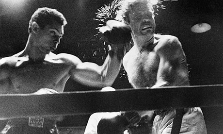
Thinking about photo-journalism reminds me of Kubrick who began as a story-telling photographer for “LOOK” magazine.
One of Kubrick’s early assignments was a boxing match, he later made the short film “The Day of the Fight” followed by his early feature film “The Killer’s Kiss.”
Kubrick shot photo-features for LOOK for almost five years.
http://static.guim.co.uk/sys-images/Film/Pix/pictures/2009/3/25/1237975390636/Still-from-Killers-Kiss-b-001.jpg
http://wecantpaint.com/log/wp-content/uploads/2008/01/17910701.jpg
http://graphics8.nytimes.com/images/2009/12/25/arts/wicpslide11.jpg
http://graphics8.nytimes.com/images/2005/12/06/books/shul1.450.jpg
http://25.media.tumblr.com/tumblr_kv86d1op2f1qassulo1_500.jpg
http://www.pd-jkt.com/wp-content/uploads/2009/08/stanley_kubrick.jpg
Andrei:
Charles–I totally agree about Ruscha. I used the term “surreal” in connection to Michals, not Ruscha.
This reminds me of Marie-Françoise Plissart’s and Benoit Peeters’ 1985 “roman-photo” “Droit de regards,” most famous for its Derrida introduction. There may be a tradition of narrative photography there that is worth investigating. Her work also seems connected to those of Christian Boltanski and Sophie Calle.