A Block of Panels in Solanin
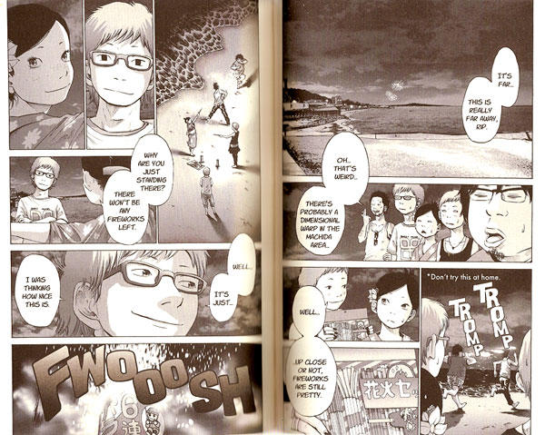
Something I’ve noted before and was reminded of as I read Inio Asano’s Solanin (Viz, 2008) this week. A lot of manga seems to use a certain layout of panels as seen in this randomly selected spread (142-143). The panels in the lower right and upper left are laid out using a similar structure.
In the case of the lower right of this spread, a group of panels, which I’ll call block-1 is divided into a vertical panel next to two horizontals. In this case the vertical comes first (remember we are reading right to left here), then the two horizontals, but the opposite is also found frequently.
The upper left shows a similar layout, but this time with four panels, which I’ll call block-2. We get the same vertical panel that leads off the block. The section next to it, block-3 is then further subdivided in a similar way to block-1, but turned on its side: two verticals and one horizontal.
This layout structure is found in numerous variations throughout this manga and many others. It’s kind of like subdividing a rectangle using the golden ratio.
