Whoa Nellie
Whoa Nellie! by Jaime Hernandez (Fantagraphics, 2000)
In the wake of Ghost of Hoppers, I’ve been rereading the post-Locas books from Jaime Hernandez, starting off with this short graphic novel. One of the best parts of his work is the way his stories constitute the ongoing lives of the protagonists. Over time the reader’s immersion in the characters and their stories grows and feeds the pleasure one finds in the reading. That sense of immersion is what makes this book pale in comparison.
The story focuses on a few minor characters, mostly from the “Chester Square” section of Locas: Gina and Xo, young women wrestlers, and Vicki, their coach. That Gina and Vicki are both relatives of Maggie (Jaime’s usual protagonist) provides some connection to the other stories, but really this book is mostly self-standing. And in that sense, I just couldn’t get into it. The normal spark of Hernandez’s stories is missing here. Of all his books, this is the one a reader could skip over and not miss anything.
The art is still top notch, though. The numerous wrestling (my enjoyment of this story may be affected by my lack of interest in wrestling, which plays a much more prominent role here than in any previous of his stories) scenes showcase Hernandez’s skill with figure drawing. The complicated angles and interactions of the wrestling is unusual for his normally less active characters. The panels end up looking like still photos, static and lacking in the kind of energy one might wish from such scenes. I’m not sure if this was purposeful or not. The scenes are put together panel by panel in such a way that it seems purposeful. Each panel has a mostly ambiguous time relationship to the previous. We know we are still seeing the same match, but the breakdowns are more like a montage of images from the match than any kind of play by play action. For instance:
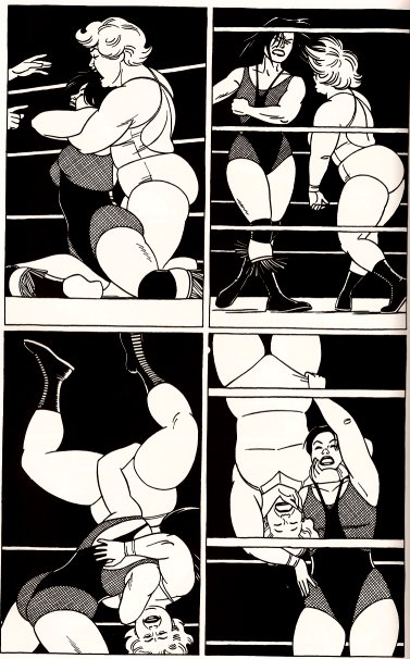
(Great use of the ropes in these scenes, too.)
It was in reading this book that I noticed how much of Hernandez’s backgrounds/settings are almost completely abstract shapes. The sense of place he creates with these shapes is impressive. He has mastered the placement of black fields and geometric lines into the impression of architecture (rooms, buildings, doors, windows). Here’s a short scene:

Three of the four panels are characters in front of black and white rectangles. Only panel one shows more than that, and even then the things in Gina’s room are minimally rendered and retain a certain schematic look. For the character driven stories that Hernandez tells, these backgrounds provide the perfect accompaniment.