Saul Steinberg
Saul Steinberg: Illuminations by Joel Smith. Yale UP, 2006.
[All Steinberg images © The Saul Steinberg Foundation/Artists Rights Society (ARS), NY.]
I saw this book in the new books shelf at a bookstore and recalled how I’ve never really looked at Steinberg’s work, despite the praise I’ve heard. So, I grabbed the library’s copy and was immediately blown away. The first illustration in the book is a great example of using stylistic diversity in a single image.

The family group shown here is not only drawn in a number of styles, but those styles act as a metaphor for the characters. In a way, Steinberg’s work is like this image, stylistically diverse, yet somehow consistent and unified.
I’ll admit to not reading this whole monograph (published in conjunction with an exhibit currently in NYC, but moving to DC, Cincinnati, and Poughkeepsie through the year). I paged through admiring the art and reading some of the commentary on the catalog pieces.
I just want to share a few images I found particularly relevant to comics (or at least my thoughts about comics). I apologize for the slightly muddy/blurry scans–the book is a little too large for my scanner. Click on them to see bigger versions.
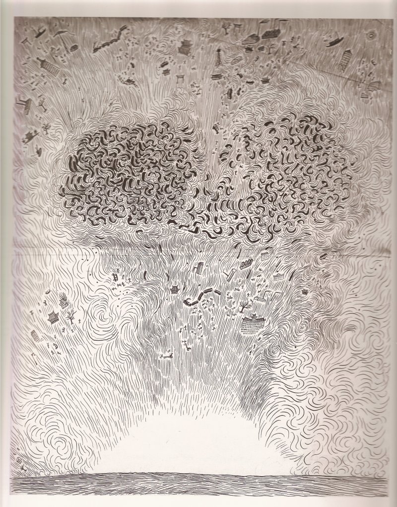
This is actually a scan of a reproduction of a photocopy, but the linework is so dynamic I had to share it. The lines have such a variety of widths, yet so consistent a form. The varying densities create a visual sense of the force of the nuclear explosion emphasized by the one area that is left blank. Sometimes the only way to emphasis nothing is to build an excess around it.
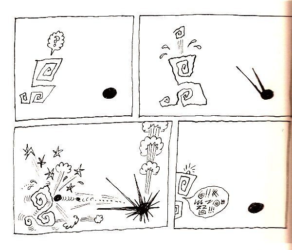
Here’s one of the very few comic strips in the book. An abstract strip that is rather reminiscent to me of Andrei Molotiu’s work. This goes back to 1960, so abstract comics aren’t all that new an idea, though this one does have a very minimal narrative to it.

Another comic-esque one, Steinberg called these “postcard” landscapes, simple abstractions. In this one he’s added on sort of historical narrative of building and what looks like a futuristic airplane. Kind of reminds me of Crumb’s Short History of America.
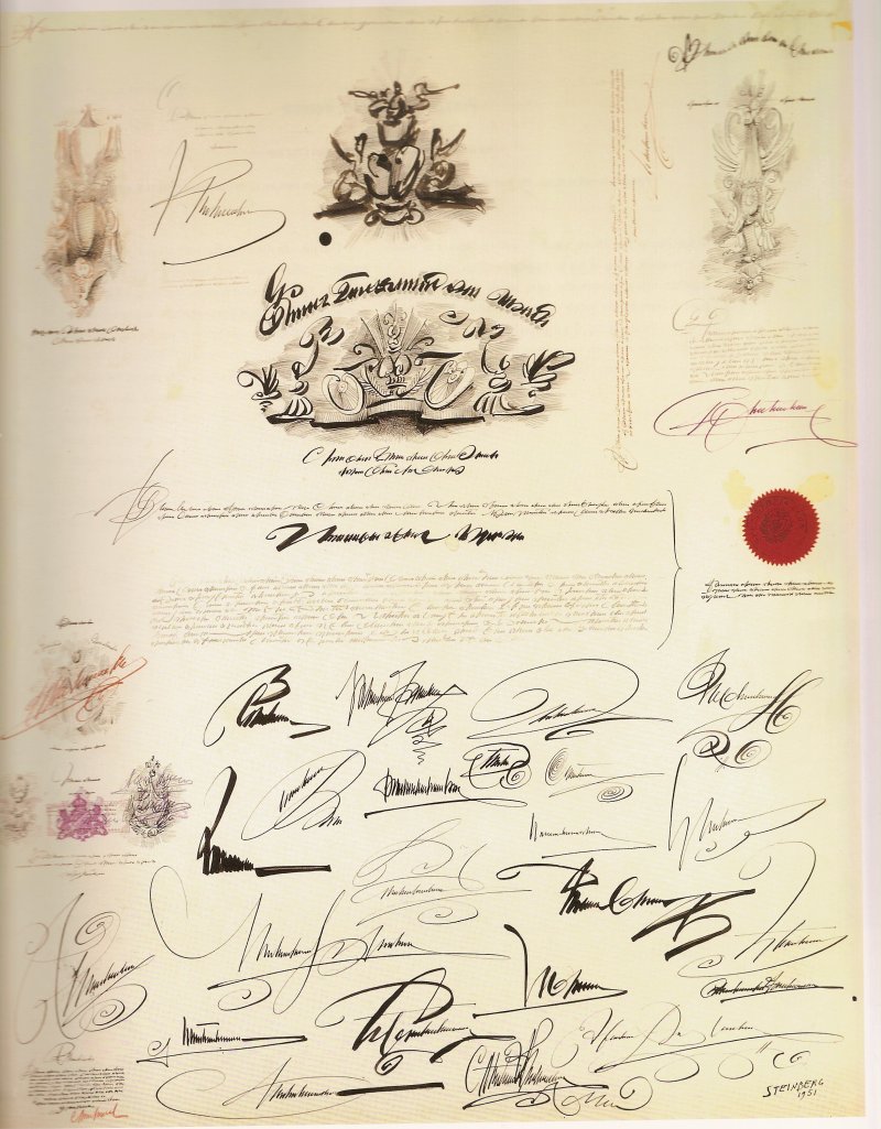
This is entitled “Big Document” and consists of fake handwriting. I can’t find a single real word on the whole document. Steinberg used this fake writing to create all kinds of documents (with seals too) as well as in his cartooning. It’s a interesting use of text as purely visual matter rather than for any communication of language.

A diary page that visual organizes text to create meaning. The left side of page (sorry, blurred because it was at the spine) is labelled for Thursday and transitions into Friday (the main center of the page) in the bottom left corner where he wrote his night time reading (and a dark triangle seems to represent night). The bottom center of the page has a stairway, wherein the lower stairs are labelled for previous years on the same date. A dream floats above at the top of the page. This is brilliant, I’d love to see more.
I highly recommend this book, Steinberg’s work is inventive, experimental, and a lot of fun to look at. The images above are just a small sampling of his styles, completely skipping the New Yorker illustrations for which he was probably best known.