On Ghost of Hoppers
Often the writers and artists I hold in the highest esteem are the ones that I find myself least able to write about, particularly novelists like Queneau, Markson, or Gaddis, but also comics artists like Jaime Hernandez. Hernandez has consummate skill with both storytelling and image-making in a minimal yet deceptive rich style.
The decades long accretion of story and characterization for Hernandez’s Maggie and Hopey allows a maximum of effect with a minimal of story. For the reader who has followed the series (now mostly collected in Locas and a few subsequent volumes) the depth of character and history that has developed adds extra power to many scenes that might hold much less interest to a new reader. In fact, I’d hazard that, much like other long running works (Sim’s Cerebus being a prime example), Hernandez’s work would be a difficult mid-way entry point to new readers. (So, if you haven’t read him yet (hard to imagine), heft up the massive Locas volume and start reading, it has a bit of a shaky start, but it’s worth it.)
Hernandez frequently draws on his characters’ pasts, both what we have seen in past issues/books and those we have not. In Ghost of Hoppers, Maggie travels back to her home neighborhood of Hoppers (where many of the early stories took place). It is a metaphorical journey back in time, where she wanders the streets, seeing how things have changed, but this is accompanied by a literal journey back in time where she sees events of the past and seems to appear to her friends in the past as a ghost. This is one of Jaime’s magical realist additions to his stories, which works on multiple levels to enrich the lives of the characters and our understanding of them.
I could praise other elements of Jaime’s work, such as the way he introduces new characters to us in the same way the protagonists meet them, with a slow unveiling of personality, history, and depth, or the way his characters age and change over the years, but I’d like to point out some specific examples from Ghost of Hoppers of his subtle skills.
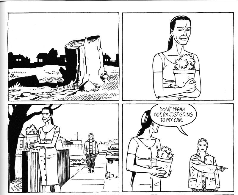
The first two examples occur while Maggie is back in Hoppers trying to retrieve a (stolen) object that she thinks her old friend Isabel took while staying with her (ah, yes, it is a bit confusing). For various reasons the two of them have been fighting. On one page, Maggie finds Isabel in church and begins following her home while they talk. The next page begins with these panels:
That first panel at first seems out of place (I add the other panels as context and because that third panel has a great minimal background). A tree stump? It immediately disappears from the frame and is not seen again. The next page begins with these panels:
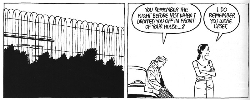
Again, a panel with what seems to bear no direct relevance to the narrative, this time a wall/fence. Only after this second time did I realize the metaphorical (symbolic?) importance of these two seemingly non sequitur panels. The chopped down tree and the fence/wall show are symbols for the Maggie/Isabel relationship. Probably not a great revelation, but the way they are worked into the narrative is interesting. They are almost not worked into the narrative at all, stray panels that look like they fit in the environment of the scene but play no direct part. That they are the subjects of panels to themselves stresses their importance but also leaves the connection slightly oblique (moreso than if, for example, he showed the two characters conversing with some wall-like object separating them). They heighten the tension and emotion in the scenes by taking a step away from the characters themselves. It’s a tactic I really like.
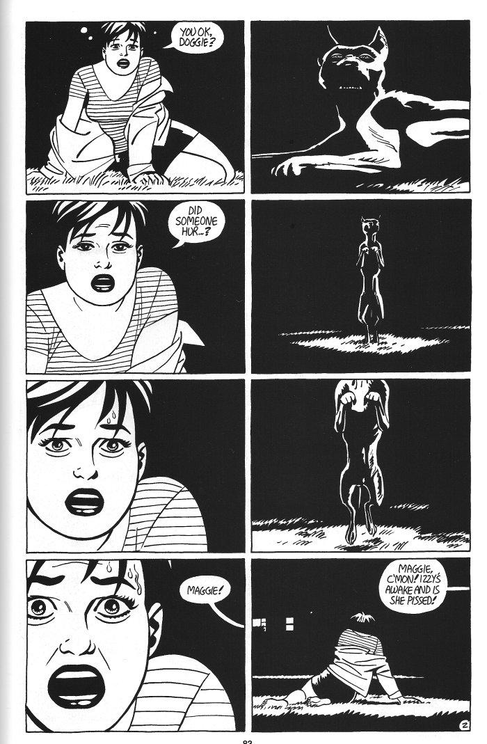
I also want to point out the following page:
It’s just a great example of page layout. The two columns cut back and forth as we see a young Maggie (compare the examples to see a great example of the way the character has aged) faced with some kind of demonic vision. By having the panels of her stacked on top of each other, the zoom in effect is made more powerful. It also visually splits the page in a way that is representative of the physical division of the characters in the scene. In this way, a kind of equivalency is created between Maggie and the dog. Note their similar positions in tier one and then the way Maggie replaces the dog in tier four panel two.
So, that’s another few small reasons why Jaime Hernandez’s work is so worth reading and studying both on macro and a micro level.
(As always, click on the images for a larger view.)


