Gray Horses by Hope Larson
Gray Horses by Hope Larson. Oni Press, 2006.
Somehow I’ve gone this long without reading one of Hope Larson’s books, despite rampant praise and some great illustrations I’ve seen around the web (including at her website). I’ve not seen a review that really explained the why of the praise. In Gray Horses, Larson displays skill with the language of comics and an attractive drawing style, and it took three readings of the story for me to really get what was going on (there was one key image that I seemed to have kept missing which pulled it all together for me).
The story begins with French student Noemie coming to Chicago (for some reason here called “Onion City”) for art school (though I’m assuming this based on the art history class we see her in and that her friend does art, we never see Noemie creating any art). She makes a friend, is pursued (albeit in an almost completely absent way) by a photography student, misses home, and has some strange dreams about a little girl and a horse.
The dreams were one thing that had me rather confused at first. Noemie seems to be dreaming someone else’s dream throughout the book. It is only late in the book that the dream story meets up with Noemie’s waking life in a subtle and unexplained way which adds a slight element of the fantastical to the book. This intrusion of the fantastic is well handled and comes off more magic realist than Fantasy.
What comes through from the story is a brief meditation on the power of images, particularly photographs. Throughout the story photographs act as talismans, images of memory and love. Noemie keeps a photograph of her ex-boyfriend (I assume they broke up in anticipation of her overseas study) on her nightstand. It acts upon her, keeping her linked to her home and separated from new love. In one image early in the book, on her first night in her new apartment, Noemie lies in bed and speaks the photo of her ex. That is, a word balloon from her mouth shows not her ex himself, but enough of the photo reproduced so we know that’s what it is. This image is at first rather baffling–why the photo?–but in the context of the book it becomes to make sense. It is only when she rids herself of the photo, that she is able to move on and meet someone new, a photography student.
The photography student himself shows another side of the power of the photographic talisman. He takes photos of Noemie at three different occasions, so that she notices the photographing but doesn’t get to the speak to him. The third time, while she sleeps in a park, he leaves behind the three photos of her. She notes that she doesn’t usually photograph well but these particular photos are very good. When he leaves her the photos, we see the photographer hiding and watching, a small heart projecting from him in a balloon. His attraction (love?) to her is conveyed through the power of his photographs.
In the dream sequence that Noemie dreams (it’s hard to say that it is “Noemie’s dream”), a little girl rides a horse to bury a photo of her brother and sister. She is sick and her possessions are all being burned (to erase infection or something) and the photo is one thing she refuses to give up. It represents her brother and sister as memory and presence, something she must both retain and hide for safe keeping.
This photo and Noemie’s photo of her ex are physically related in the story by a trading of places. They are also metaphorically similar. Like the photo of the brother and sister, the ex-boyfriend’s image is something to be saved as a memory and experience but it is also something that must be hidden away, so that Noemie can move on with her life to new boys, new loves. There are other instance of photographic or iconic power in the story, but I will leave the story to discuss the iconic power of Larson’s cartooning.
Larson’s style is simple and fluid, iconically representing the world without a profusion of details (or rather with just enough details). It’s a very effective communicative style that has a few fascinating facets both in general and in relation to the story.
There are no panel borders in the book. Her panels are unbounded and amorphous. Their wavy edges (mostly from the use of the pale peach that provides tone for the black lines) have the appearance of what would traditionally be used for dream sequences in other comics. Both the “real” sequences and the dream sequences use these same types of panels, visually bridging the two in a way that only occurs in the story itself much later in the book.
Larson’s style is especially pleasing for the way she represented a plethora of normally unseen phenomena, such as sound, light, wind, thoughts. She uses traditional comics icons in singular ways that are evocative and effective. A few examples:

The top panel is a quick example of showing smell with simple wafting lines and text to name the smell. It’s completely abstracted from the smell itself, but it still works, particularly with the way the text is integrated into the drawing. The bottom panel just has a nice illustration of a certain feeling, again text nicely integrated.

Larson uses arrows in a number of drawings. In this case to illustrate Noemie’s half-awake hearing of a sound. Larson integrates an inset panel showing us the source of the sound (interesting that it looks like a photo). The little loop in the balloon tail is used frequently in the book, though I can’t see it having any particular signification (it’s used too much to mean anything).
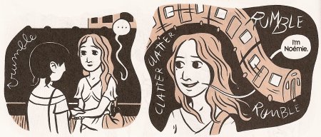
Another interesting use of sound. Here, we see her use of sound effects that are more descriptive than onomatopoeic (at least in my opinion). I love the way the image of the train and its sound wrap themselves around Noemie and get between her and her words.

Here is something we see occasionally from John Porcellino (actually the above mentioned use of descriptive sounds is typical of him too): the textual naming of something in an image that just isn’t clear from the image. In this case it’s not a limitation of drawing skill itself but rather the nature of simplified imagery. This occurs a few times in the book, sometimes usefully, sometimes unnecessarily. It’s an interesting tactic, that for some reason, I really like. Comics are words and pictures, why not use the words to enhance the understanding of the image itself, rather than for just narration or sound.

Just another great use of word balloons for extra emphasis.
I could go on and on, but I think those hit the major types.
As you can see, I really fell in love with the visual style of this book. It is subtly simple, much like the story. Both improve dramatically in depth and sophistication with rereadings.