Garo Manga Exhibit
The other weekend, my wife and I took the train up to NYC to see the Garo show at the Center for Book Arts. The show itself was contained in a small room, but it was packed with work. Almost all of it was issues of manga magazine Garo displayed to open page spreads. I haven’t seen any other shows that consist so completely of mass produced, printed materials. By displaying the magazines open yet out of reach (behind glass mostly) it really made me aware of how much more there was to see that I couldn’t access. You view/scan/read (I say read loosely, since the material was all in Japanese, which I don’t read) the spreads and then want to turn the page. I wish there would have been a least a couple issues there to page through to get a feel for the design and the whole package. Were there advertisements? Letters columns? I’m not sure. The art was the focus here.
The show focused on probably a dozen manga artists that published in Garo between 1964 and 1973. Some were represented with a great many examples, while some were only represented by a page or two (in particular, what was apparently, the only regular female contributor). The accompanying captions briefly discussed the history of the publication and some details about the artists and their work. What was quite surprising to me was how many of the artists I have read work by or, at least, seen work from before. I expected that more of the artists would be unfamiliar. I guess this is some indication of the spreading of translated manga out of the most popular and mainstream works.
Shirato Sanpei, one of the founders of Garo, was the most represented artist, featured in a number of covers and a lot of pages from his manga. I’m familiar with Shirato from the early translation of his Legend of Kamui by Eclipse/Viz. I’m actually quite surprised we haven’t seen more of his works appearing in English. I’d love to be able to read the full Kamui series, and it seems like the sort of thing that would be popular: feudal japan, ninjas, action, mixed with a lot of history and social criticism. Plus the art is great, a scratchy, dynamic line and a great sense of realism mixed with fluid action. Seems like something Dark Horse would go for. It’d make a good companion to the various Kazuo Koike works they’ve done.
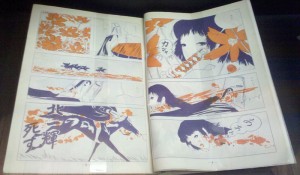
Many of the artists featured have been recently published by Drawn & Quarterly, such as Katsumata Susumu (Red Snow), Tatsumi Yoshahiro (Drifting Life, and the three volumes of his short stories), and Hayashi Seiichi (Red Colored Elegy). I particularly like Hayashi’s work, and was happy to see some new (to me) pages from him. A couple pages were printed in purple and orange, which he put to wonderful effect. I snapped a photo of one of them. Note the use of the orange in the panels.

Click for larger.
Some of Kazuichi Hanawa’s pages were shown, whose only English translation is Doing Time from Fanfare/Ponent Mon, which I still haven’t read. A number of the artists were also familiar because I’ve seen some of their work in French translation, such as Abe Shin’ichi, Mizuki Shigeru, and Tsuge Yoshiharu. Since seeing the show, I’ve read Tsuge’s L’Homme Sans Talent (in French from Ego Comme X) (more on this one at another time). The weird surprise for me was seeing some work from Ikegami Ryoichi, whose been published quite a lot in English (going back to Mai the Psychic Girl). The pages shown were quite nice. Here’s an example:

Click for larger
I also quite enjoyed this page by Suzuki Oji:

Click for larger.
Also of interest, the work by Sasaki Maki whose works are often narratively abstract and feature collage and appropriation from various media sources. I’ve seen some of his work online before and it is almost completely alien. He uses figurative and representational imagery, for the most part, but the sequences never cohere into anything story-like, as far as I can tell. It’s theoretically fascinating, but also kind of dull.
There was a predominance of work printed in purple ink. I’m quite curious about the reasons for this. Was it cheaper than black? Was it just for variety’s sake? I know other manga magazine often print in multiple monochromes across the same issue, but I’m not clear on why. (Maybe someone reading this knows and can enlighten me.)
In the end, I feel a little distant from the exhibit. The work seems so out of context, not historical or cultural context, but reading context. A magazine behind glass. A comic where you can’t read the language and you can’t read the pictures (at least not as multi-page works). The feeling is like reading the excerpt of a novel, it might intrigue you, it might catch your interest, but in the end it’s an entry-point to reading the whole novel. But, in this case. I can’t read the whole comic for a majority of the works in the show. Also, unlike some other comics related exhibits I’ve seen, this wasn’t about the original art, so there’s no sense of appreciating those elements of the work that are not apparent on the printed page.
While in NYC we visited the MOMA which is always a great place to visit. I like revisiting some favorite works that they seem to keep up all the time, and discovering new parts of their rotating collection. I was, as always, struck by this De Chirico painting: Gare Montparnasse (The Melancholy of Departure).
There were a number of Louise Bourgeois pieces on display. I’m not sure if that was because she had died about a week before, or if it was just a coincidence (maybe a little of each). I quite liked some of her prints in the “Alternate Abstractions” exhibit, such as this one entitled “The Upward Journey.”

Click for larger.
I was also delighted to run into a Pierre Alechinsky painting (The Complex of the Sphinx) in a show about modern art and mythology. I’ve written on Alechinsky before, but I’ve never seen one of his pieces in real life before this.