Ga(ro/ps)
1.
The gaps between panels are one of the most prominent visual elements of comics. If the word balloon is eminently more iconic of “comics” to the wider public, for me it rarely takes more than two quadrilaterals separated by a thin band of blank space to see “comics.” The gutter is a structuring gap that separates two images: it separates but does not remove the relation, creating a tension between pulling apart and bringing together (a gap requires two ends around the space in the middle)[1]. In addition to the gutter—which separates individual panels—the page, its margins, and the action of turning the page are structuring gaps in most paper-based comics (the click or swipe in many digital comics). The page separates the hyperframes from each other but, through their proximity, maintains a unity across surfaces.
2.
As a historically “low” form, printed cheaply as disposable artifacts, any historical conception of comics is gappy, from forgotten comic strips/books to innumerable pages of uncredited work and beyond. The gappiness only increases when crossing international and language borders. The American-English speaking world’s conception of European comics is riddled with gaps due to language and distribution barriers, but it is little compared to the gaps in the conception of Japanese manga from this side of the international/language divide, due to even greater cultural and linguistic differences. At a broad level, the American-English speaking world has been exposed to only bits and pieces of manga, leaving large swaths of the history/bibliography unknown. This is notably the case for historical periods predating the “manga boom” and those genres that fall outside what American-English publishers believe would be popular. These gaps are so broad as to be almost unknowable for the non-specialist, but to focus on one area that is at least partially known, we can have some sense of the gaps around the influential manga magazine Garo.
In some ways, the history of manga in the U.S. starts with Garo. Of the earliest manga series published in English, three have connections to Garo. The Legend of Kamui (Eclipse/Viz, 1987) by Sanpei Shirato was originally published in Garo. The series translated into English is a sequel (of some sort, I’m not clear on the connection other than the continuing character) to Kamui-Den, the series for which Garo was originally started as a showcase. Less directly, Mai the Psychic Girl (Eclipse/Viz, 1987) artist Ryoichi Ikegami published in Garo in the 60s and worked as an assistant to Garo artist Shigeru Mizuki[2]. Another early English translation, Lone Wolf & Cub (First Comics, 1987), was drawn by Goseki Kojima who worked as one of Shirato’s assistants on Kamui-Den. None of these works were (or are) considered avant-garde or “alternative.” I imagine they were all chosen as translations because of a perceived popularity in regards to their genres and existing American comics: Kamui‘s ninjas and Lone Wolf‘s samurais had pre-existing models in the United States, and Mai, even just from the title, is reminiscent of the then very popular X-men (Mai as Japanese Jean Grey).
Then a gap (for most of the manga boom) until 2005 when Drawn & Quarterly begins publishing manga with a series of volumes by Yoshihiro Tatsumi as well as volumes from Seiichi Hayashi, Oji Suzuki, Susumu Katsumata, and Shigeru Mizuki, all of whom did work for Garo in the 60s and 70s (they also published Imiri Sakabashira, whose works from Garo appears to date from later years). At this point the name Garo seems to really take on its role as a metonym for “alternative manga.” The popular (is such a word can be used for fairly niche market publications) conception becomes most associated with restrained short stories (or single volume “graphic novels”) drawn in a style rather stiff (Tatsumi) or cartoony (Mizuki, Katsumata) with the occasional magic realist or surrealist flair. These works fit nicely with a North American comics fan’s idea of “alternative” or “literary” comics as a personal and expressive rather than a commercial art. They can be seen as sitting in relation to mainstream manga like Dragon Ball or Sailor Moon the same way other works from Drawn & Quarterly sit in relation to the “mainstream” superhero comics in America, both through the less slick (and often crude) art styles and the use of self-contained narratives rather than (nearly) endless serialization.
3.
Seiichi Hayashi’s Red Colored Elegy (originally in Garo from 1970-1971, published in English by Drawn & Quarterly in 2008) is my favorite Garo-related manga to make it into English (or French, in which I’ve also read some manga). A good part of my preference for it, besides its general visual flair (and shifting stylistics), is what I call its gappy aesthetic. Where most comics (especially those predating 1970) are almost obsessively concerned with a clarity of narrative and a smooth bridging of the gutteral gap, Hayashi takes the elements of his narrative and introduces greater gaps between panels and pages, taking a cue from the French new wave filmmakers whose works were making their way to Japan at the time[3]. The transitions between Hayashi’s panels and pages are often abrupt, abstract, or metaphorical. Time, beyond the scenic moment, loses clarity. Scenes become fragmented.
Hayashi does not spell out all the plot points nor does he tell us every last thought and feeling of the characters, rather he uses allusion and metaphor to let the reader draw out conclusions (what conclusions there are to be had) and to create emotional and narrative effects. The elliptical construction of this manga forms a narrative that is more loose and insubstantial than any plot summary I’ve seen would have you believe. What could be a fairly straightforward romance/melodrama narrative is transformed.
Summarizing the plot of the manga seems almost beside the point, but… The story shows us Ichiro and Sachiko, a young unmarried Japanese couple, living together and struggling in their jobs and personal lives during the end of the 60s. They are isolated and isolating, pushing themselves away from their families and, often, each other. Ichiro works at home as a freelance animator (an inbetweener, drawing the repetitious minor images between the key images) while Sachiko is a tracer at an animation studio. Ichiro wants to make comics (he says that a lot); Sachiko is less clear in her wishes. That the female character is much less developed (and primarily acts in relation to the man) is par for the course in almost all the manga I’ve read from Garo. Both seem distraught, depressed, and almost aimless. There really isn’t too much of a plot, and that’s fine. Red Colored Elegy is about mood and feeling and foregrounding the art/form of the comic itself.
The first few pages of the manga are worth taking a closer look at, as they offer a group of jarring transitions and address the themes that will take up the rest of the story. The first page is a single image, a high contrast drawing that looks like it is a copied/manipulated photograph of a man. He has a star in his eye and another shooting out of him. A juxtaposed poetic text is either translated poorly or excellently, because it reads like juvenilia (it is highly possible in this context that it is purposefully so), and it acts like an epigraph (“My life is an open book, I live it page by page. For what, I don’t know…”). Does this clue us in to pay attention to the page as a unit of narrative in the manga? Certainly, it does point at the existential void in the protagonist’s lives.
This page is followed by a scene with Ichiro walking alongside a headless Disney-esque cartoon character who is telling him to quit his animation job. Ichiro stabs or punches the character (blood/ink spurts out of him, the two are often equated in the book), and we see a barbed wire fence with the character’s white glove hanging on it. At this point in the story, it is not decisive whether this is a real or imagined event, though after a full reading, we can tell that this is some kind of mental projection of Ichiro’s. The imagined violence bubbles beneath the surface of his life.
The single page that follows contains what looks like two film strips side-by-side (eight frames of which we can see) showing more copied photographic images of a young woman’s head. We see her words; she is talking to someone (“I thought you were going to draw comics,” “I should quit my tracing job,” “maybe I’ll get married”). These fragments are clear indicators of the story to come, and the first quote would lead me to believe that this is Ichiro and Sachiko renewing a formerly casual acquaintance, starting the relationship that we see in the rest of the book.
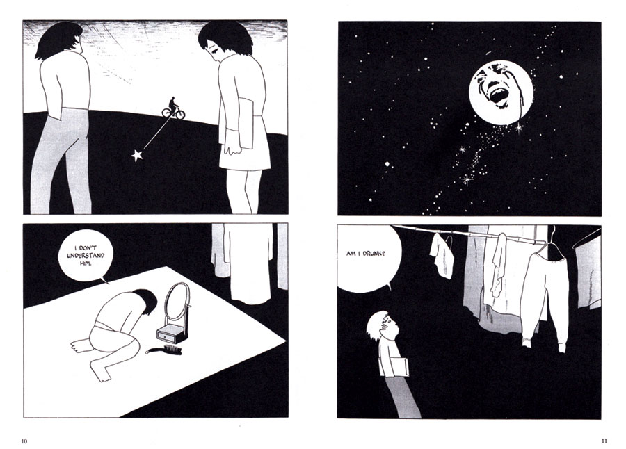
The four panels that take up equal portions of the next two page spread (10-11, see above) are of elliptical connection. The first panel shows Ichiro and Sachiko walking along, the former with his shoulders hunched, the latter with her head lowered. On a distant horizon we see the silhouette of a person riding a bicycle. A line from the bicycle into the black that makes up the background below the horizon leads to a white star situated between the two characters. The second panel shows Sachiko kneeling and bent forward in front of a small mirror. A word balloon shows her words “I don’t understand him.” The third panel shows another seemingly photographic face, this time inset into the moon surrounded by a night sky. Black tears stream down the face and the mouth is open in an anguished cry. The last panel shows Ichiro standing under hanging laundry, speaking out the words “Am I drunk?” (I should add here, that Hayashi’s compositions are often quite excellent, and this page is a good example of that.)
These six pages are, to the first time reader, exceedingly opaque. What is going on? Who are these people? How does one page relate to the next? The reader is left to create their own connections or to just read on through without forming any (art of this sort is often as much about rereading as reading). The characters, drawn in a very simple outline with few details, can be difficult to differentiate (and how does the photographic imagery relate to the simple drawings). The panel of Sachiko kneeling in front of the mirror is primarily identifiable as her because of a single line that crosses over her leg above the knee, delineating the hem of her skirt. These simple and subtle differentiations are found throughout the book. The reader must pay close attention.
While the narrative has numerous conventional panel sequences (notably, ones that in their close time sequencing are reminiscent of the animation on which both protagonists work), Hayashi often juxtaposes panels that fit together in unusual, indirect ways. One page (21) offers a kind of metaphorical panel transition of undecidable subjectivity. The top panel shows Ichiro and Sachiko standing under a blossoming cherry tree. Sachiko has just told Ichiro that her parents have arranged a marriage for her. “It concerns you too you know,” she says. “Me?” he replies. They are separated by space and his word balloon. The following panel shows Snow White and Prince Charming in a smiling embrace as blossoms fall around them. I’m left wondering, is this a mental projection of one of the characters, a picture perfect romance filtered through animation (an apt image since they both work in the field)? Or is this an ironic commentary by the author/narrator, commenting on the storybook naivety of such an idea? Either way, the juxtaposition of the two images raises connections, questions, thoughts, and feeling through a method that is rarely seen in comics. A diegetic panel juxtaposed with one that is indeterminately extra-diegetic.
We see something similar late in the book (222). The couple decide to end their relationship. Sachiko points her finger out like a gun; “Bang!” goes the sound effect. The following panel shows Ichiro lying dead on the ground, blood splattered and spilled. This is more directly metaphorical, yet still a striking transition. The metaphorical blood sends us back to that early sequence of Ichiro asssaulting the cartoon character, a more distant gap to be traversed. This braiding (see Groensteen’s System of Comics (U Mississippi, 2007)) that connects disparate parts of the comic is another frequently used gap in Hayashi’s book. The narrative and visual gaps are not only sequential and are drawn out through rereading.
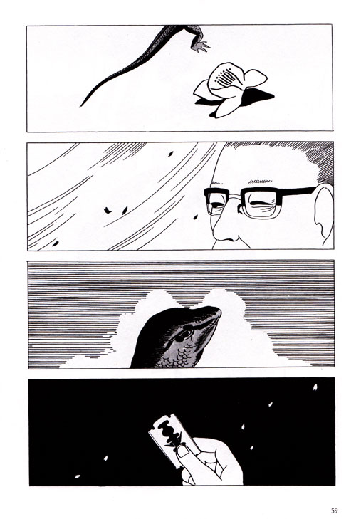
Some of the sequences are more difficult to bridge. One (58-60) starts with Sachiko’s father, in a single page image, one eye open, one eye closed. The four panels of the next page (59, see above) show: a lizard’s tale with a flower blossom, the father’s head with blossoms/leaves blowing in the background, a lizard’s head with clouds in the background, and a hand holding a razor blade with blossoms again in the background (this time in white on black). A turn of the page brings another full page image showing the father, slumped over, grasping his wrist as blood spurts from it. I have no idea why the lizard is there. I’ve puzzled it over and think there is some symbolism I am missing (like the cherry blossoms, perhaps something cultural).
Even thematically, I can read gaps into (and out of) Red Colored Elegy, as the narrative itself is focused on two major gaps. The plot is most obviously a progressive widening of the gap between the protagonists Ichiro and Sachiko, as they distance themselves from each other and their relationship falls apart. Less directly it sounds the gaps between dream and reality (Ichiro’s dream of making comics and his reality of endless drawing for animation studios). I can also see the gaps between everyday life and politics (for Sachiko) and those between generations (the protagonists and their parents).
In general Hayashi’s gaps foregrounds one of the comics most specific elements, the juxtaposition of images. His broadening of the gaps forces a slower reading and invites a closer reading, working against comics’ historical norms of “smooth” transitions and clear narrative. Red Colored Elegy cleared a path that, 40 years on, has been followed rarely.
4.
In reading Red Colored Elegy, I find some aspects of the narrative or elements of the visuals obscure (like the lizard on page 59 mentioned above). Not just from a perspective of the plot, but from an intertextual and extratextual vantage. Hayashi is explicitly referencing aspects of contemporary culture in his work. Some of them are taken from an international popular/art culture (I’m pretty sure that’s a large image of James Dean on page 52), while others are domestic to Japan, such as the references to/quotations from songs (popular or traditional, I don’t know). Being neither Japanese nor a student of Japan, these references are a gap in my reading. These gaps will vary from reader to reader; I imagine many of them will exist consistently for contemporary American-English readers.
In a cultural vein closer to my own, I’m convinced the scene with Sachiko pretending to shoot Ichiro with her finger is a reference to a Godard movie (Breathless?), though I’m not sure without rewatching a bunch of his films. Maybe I’m filling a gap that doesn’t exist. A clearer reference is found in a two page spread where panels of Sachiko and Ichiro are intercut with panels containing text, a single sentence spread across five panels: “What a middle school grad needs to do to succeed” (26-27) is quite Godard-esque (including the graffitied way the text is written, adding a reference to contemporary political events). Godard often intercuts/interpenetrates text with images in that manner. Whether that was an explicit reference by Hayashi or is simple my own reading, I cannot say.
1b.
Our conception of comics allows us to bridge the structural gap between individual image panels and see them as one unit, the comic itself, instead of isolated imagery. This ability to unify/group images is one way works not culturally defined as “comics” can be seen in relation to comics, by translating the gaps. In the National Gallery of Art in Washington, DC there is a room containing the 14 paintings of Barnett Newman’s “Stations of the Cross.” Read the white walls as gutters and margins and you can see them as comics or at least comics-esque: a wall that is a page, a page that is a wall. In a similar sense, placing almost any two images together on a page and it begins to invite a “reading” as opposed to just a looking, as the reader/viewer tries to bridge the gap between the two images, no matter how disparate.
2b.
That gap between 1987 and 2005 is not as large as I make it seem, and perhaps it is just a reading on my part to remove aspects of the history I don’t want to see. Between those years a number of one-off anthologies as well as a few isolated translations (like Tsuge’s “Screw-style” in the pages of The Comics Journal) presented other selections from the pages of Garo. Three anthologies that featured some work from Garo (Sake Jock (Fantagraphics, 1995), Comics Underground Japan (Blast Books,1996), and Secret Comics Japan (Viz, 2000)) primarily showcased work from the 90s (at least the latter two, bibliographic data for Sake Jock‘s contents is lacking) which show a considerably different conception than the work published by Drawn & Quarterly. The majority of works in these anthologies from Garo or artists who published in Garo are nonsensical, dreamlike, surreal, and/or grotesque, using a variety of styles from a kind of photorealist style to a cute cartoon style to the “hetauma” bad/good style (for example: Kazuichi Hanawa, Takashi Nemoto, Nekojiru, Muddy Wehara, and Usamaru Furuya). In comparison with the “alternative” comics of the D&Q published work, these Garo works could be seen as the “underground” or “art” comics version of manga (however much a misnomer those two terms are), especially if one takes Douglas Wolk’s equation of the latter term with “ugly” art (Reading Comics, Da Capo 2007).
Even this ignores other artists, whose styles are reminiscent of neither of the above trends, that were published in Garo and have made some appearances in western languages. Kiriko Nananan’s sparse stories about contemporary relationships (best featured in English in Blue (Fanfare, 2004)) are narratively gappy while maintaining visual continuity. Hinako Siguira’s work (some volumes available in French) both takes place during and is drawn in the style of Japan’s Edo period.
As Borges said, “every [artist] creates his own precursors.” In this sense we fill in our own historical gaps, and we also add new gaps where they do not need to exist. For me, Garo is Hayashi, Suzuki, Nananan, and the strange photo-referenced stories by Maki Sasaki from which I’ve only seen isolated pages. Primarily, this is the experimental/poetic vein. I leave the hetauma style, the grotesque, and Tatsumi to fall in the gaps.
3b.
Kazuo Kamimura’s Dousei Jidai (1972-73) tells a fairly similar plot to Red Colored Elegy: the dissolution of a cohabitating, unmarried young couple’s relationship. Both couples are artists, struggling with work and family. You could summarize both works with the same few sentences. In fact, Dousei Jidai‘s first chapter followed not long after the ending of Red Colored Elegy, and the similarity is no coincidence[4]. But what is not similar is how much Kamimura’s aesthetic differs from Hayashi’s. Hayashi’s story is all gaps, jumps, and symbols in a shifting visual style. Kamimura’s is consistent and smooth. His use of metaphor and symbol is clearer, more direct. His storytelling is decompressed—to use the term that has become almost equivalent with manga—drawing out each scene for many pages where Hayashi might only use one or two panels (compressed? hyper-compressed?). That Dousei Jidai is 2100 pages to Red Colored Elegy‘s 230 does not come as a surprise. If Hayashi is gappy, Kamimura is all clearly marked roads and bridges. His protagonists are like filled-in versions of Ichiro and Sachiko: their thoughts are clearer, their emotions are expressed, even their sex lives are more explicit. Kamimura takes time to linger over a scene, to explore a setting, and to show the shifting emotions of the characters. This is not to say Dousei Jidai leaves nothing to the imagination or to inference (not everything can be shown or said), but the reader does end up experiencing a very different story. For the interested reader, the two works stand both together and apart, a fascinating and exemplary contrast in comics narrative.
4b.
These types of gaps are often lessened through the paratexts: footnotes, endnotes, introductions, afterwords. Many manga series include translator’s notes to explain cultural specificities (if not necessarily intertextual references). Drawn & Quarterly seems resolutely against such paratexts. Even the original place and date of publication is omitted in their translations. At no point is Garo mentioned on the Red Colored Elegy volume and the original date of publication (1970-1971) is only mentioned on the paper band that encircles the back cover. Their translation of Oji Suzuki’s A Single Match includes even less information, citing neither publication source nor original date. These gaps are frustrating to me and do a disservice to comics history in general, as they tend to create misreadings and misconceptions of the cross-cultural history (misreadings that I am probably not clearing up here). With all this context left out, readers are forced to find or generate their own, which can lead to misinformation spreading (especially online). For instance, in the text above I mentioned Susumu Katsumata’s work as coming from Garo, but after the writing I was informed that the stories from Red Snow did not originally appear in Garo ( though Katsumata did publish in the magazine). Also, the general (incorrect) conception that Viz’s The Legend of Kamui is a translation of Garo’s primary serial from its early years, Kamui-Den, has spread from a lack of historical and contextual information.
Until we see a fuller picture in English and some gaps get filled, we are all just seeing the Garo in our mind. What we draw from that imaginary Garo may or may not be “true” to the historical magazine, but in bridging the gaps we are at least staying true to the form.
—DB, Aug 2012
[1]
Charles Hatfield discusses comics as an “art of tensions” in his Alternative Comics (U Mississippi, 2005). Two of his tension, “single image vs. image-in-series” and “sequence vs. surface”, are most often found through the gaps.
[2]
Most of my Garo related knowledge that does not come from reading the manga itself (in English or French) comes from Ryan Holmberg’s Garo Manga: The First Decade 1964-1973, a 2010 exhibit at the Center for Book Arts in NYC and its accompanying catalog essay. Other information comes via Bill Randall (see note 4) and maybe a tiny bit taken skeptically from various internet sites (primarily for connecting more recent authors to Garo and seeing samples of artists with whom I’m not familiar).
[3]
Hayashi admits the influence in a 2010 interview: “Their [Nouvelle Vague movies] narrative composition was also especially interesting to us: to cut the story so it wouldn’t seem so simple – as in Breathless.”
[4]
For historical information on Dousei Judai, I am indebted to Bill Randall’s column in The Comics Journal 295 (2009). While you’re digging around in the back issues read his column on Red Colored Elegy in issue 292 (2008). Dousei Jidai was translated into French as Lorsque Nous Vivions Ensemble v.1-3 (Kana, 2009) which is the version I’ve read.
Images from Red Colored Elegy by Seiichi Hayashi (Drawn & Quarterly, 2008), copyright 2008 Seiichi Hayahi$1
[This essay originally appeared in Secret Prison #7, edited By Ian Harker and Box Brown (2012). Buy a Copy it has a lot of comics in it.]