(at The Hooded Utilitarian) “A Peter that Never Existed”
I have a long post up at The Hooded Utilitarian for their roundtable on Wonder Woman No.28. I go on and on about the style of WW artist Harry Peter. The piece ended up being an attempt to figure out how I could describe and discuss “style” in a comic, which isn’t all that easy: partially because of all the moving parts, so to speak, of comics and the vagaries of who did what in a multi-creator comic (including uncredited assistants), as well as a lack of surety on terminology when discussing aspects of the work. But there it is, and there are some great images by Peter.
Here is the whole article, for posterity...
I’m not a fan of the superhero genre in general, and, while I do own a volume of the Marston & Peter run of Wonder Woman (henceforth WW), I find I enjoy reading Noah’s posts on the series more than reading the series itself. That’s not a bad thing, I guess, good criticism should increase our enjoyment of a work, right? (And now I’ve set myself up for failure.) So why am I participating in this roundtable: there’s something about I love about Harry Peter’s style. But what does that even mean? What is style in a comic: how do we talk about it, and what is distinctive about Peter’s that appeals to me? That is what I am going to try to address. We’ll see how it goes, as this post is as much an investigative process for me as it is any kind of coherent result. Let’s consider it a kind of close reading.
What constitutes the (visual) style of a comic, and more specifically how can we address the individual’s style? There is surprisingly little written about this subject in regards to comics (or else, I’m just not finding it, suggestions in the comments please). Harvey, in his Art of the Comic Book, lists style as one of the four “distinct graphic threads”, yet punts on the issue saying its “storytelling role” is “too subtle for much elaboration here.” (9-10) McCloud addresses style in Understanding Comics in the form of his big triangle and his charts of panel transitions, but he tends to generalize his discussion into broader groups and effects (and the placement of artists on that triangle often seems pretty random). Wolk writes about style in a very broad way when comparing the “mainstream” to “art” comics, but his discussion tends to over-generalize to make his point. Groensteen offers a decent introduction to comics style in his La Bande Dessinée: Mode d’Emploi, pointing out the inclusion of elements other than just the drawing/inking/coloring in the style of comics and comparing a few different artist’s styles, but it’s an introductory book so he doesn’t go into a lot of detail.
Style in comics is more than just line, tone, color, composition, and the way the images are drawn (realistic, caricatural, detailed, minimal, etc.), it is also the page layout, the découpage (“narrative breakdown” is what Harvey calls it, but I feel that the French word is less specific to narrative comics–not to be confused with shellacking paper onto boxes). All these elements work together to give the comic its style (one could, depending on the work and its context, add other elements, but for the purposes of a comic book like WW, this should do). For a single author work it is easy to attribute all these factors to the stylistic of the author, but this attribution is more difficult for the corporate comics structure that Peter worked in for WW.
Page layout, découpage, and perhaps composition can be partially or wholly attributable to the writer. Some comics writers write detailed scripts breaking down the narrative into panels, pages, even describing specific images and compositions (I’m looking at you, Alan Moore). Without seeing a script it is hard to ascertain this level of credit. Similarly, many of these comics are inked by a different artist than the one who pencilled the images. How can we then attribute the visual style of line, tone, detail? The inker could faithfully or loosely follow the pencils; the inker can add or leave out details; the inker can exaggerate or tone down the penciller’s figures. (Probably the most prominent place to see this addressed in discussions concerns the various inkers of Kirby’s work, though I’ve found it relevant in looking at Toth’s work also.) Color can also be wholly or partially attributable to hands other than the artist. Most corporate comics are colored by someone else (nameless in the days of Peter’s work), and who picked the colors is not always clear. It seems to have been common that newspaper strip artists provided color guides, but I believe that would be unusual for comic books at the time of this work.
The Grand Comics Database credits Peter did his own inks on WW, though Nadel notes that he was “aided by a number of usually female assistant” (28). This calls into question how much of the pencilling and inking we can consider “his.” But for the purposes of this post, I must assume that Marston gets credit for the story and text as well as at least some credit for the découpage, and Peter gets credit for everything else except the coloring (maybe the lettering, but I’m not concerned about that). Much of this is supposition on my part as I have not seen one of Marston’s scripts, and I don’t know the historical details of who did what. These basic assumptions give me some limitations to work within. I’ll start at the broader level and move towards the specific. For better analytical purposes, I will be discussing both issue 28 (Mar/Apr 1948) and issue 3 (Feb/March 1943). Images will be cited as ISSUE: PAGE.PANEL where I am using the page numbers on the art itself (in both cases consisting of a number and a letter (for the parts of the issue)): so the fourth panel on page 2 of issue 28 is “28: 2A.4.”
Page Layout
At first there appears to be nothing unusual or stylistically distinct to note about Peter’s page layouts. Other than the splash pages, every page in Issue 3 has 3 horizontal strips, each divided into 2 or 3 panels (6-8 panels per page). With only 2 exceptions (3: 7B,9B) every page is based on the 9 panel conventional grid layout. Even the splash pages have the single small panel that is basically 1 panel from a 9 panel grid.
Issue 28, 5 years later, shows some development in Peter’s layouts. The splash pages are now just single images. All but two of the remaining pages have between 5 and 7 panels, still quite conventional. Most are still based on a 9 panel grid, but he varies some of the panels in size to fit the composition/content: tall panels for dramatic full body images or vertically-based action, wide panels for large groups or horizontally-based action. The pages are still primarily formed out of three horizontal strips of 1 to 3 panels each, but a number of pages are formed of two strips, most often in what Chavanne calls a “fragmented” layout. For instance on page 3A the top strip starts with one tall panel (a focus on full figures) followed by two stacked panels (horizontally-based action). (For an example see the full page image in the composition section below.)
This use of the fragmented layout is not unusual to contemporary readers, as it is, at this point, a convention. I didn’t think much of it either in the context of Peter’s work until I started looking at other comics I had on hand from the time period (or a bit later, I don’t have many comics from the late 40s). Tarzan No.2 drawn by Jesse Marsh, also dated March/April 1948, proves to be even more conventional with all but 2 pages having 6 panels (3 strips, two panels each). The first three comics (drawn by Lily Renée, Matt Baker, and Warren King) dated in 1949 from Romance Without Tears all have pages with 3 strips and 6-7 panels each. The first few stories in Krigstein: Comics from 1949 also show no use of the fragmented layout. Peter’s own Man o’ Metal comic (found in Nadel) includes a couple uses of the fragmented layout, though I notice that each time it’s used Peter has included little arrows to direct the reading path. This is an another indicator that this particular type of layout has not become convention. So perhaps Peter’s layouts, with the use of these fragmented layouts, are a little more unusual for the times than I thought, though I still don’t think we can consider them a distinctive stylistic element.
More subjectively, it’s hard to say that anything about the layouts are expressive. They are mostly invisible, in the sense that unless you really look at them, they go by unnoticed. They just serve the narrative neutrally, panels placed into the page to fit the content and keep the narrative continuing smoothly. Of course, dividing the page in these ways is also the simplest from a production standpoint, which is important when you’re trying to draw a lot of pages on a schedule.
Panel Composition
Like most comics (especially at the time), characters/figures are the primary focus of the compositions. I count 8 (issue 3) and 6 (issue 28) images that are (arguably) not focused on a character or group of characters, and only 3 and 1, respectively, of those have no figures at all (it’s the monkey changed into a “prehistoric tree fox,” in issue 28 in case you’re wondering). That said, Peter does not neglect the backgrounds (since the figures are the focus, I feel safe calling everything else the “background”). He creates and maintains a sense of the settings, only occasionally eschewing any background at all, usually in cases of crowded figure groups (28: 7A.2), close-ups, and panels with lots of text.
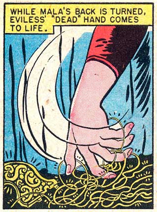
On the whole he uses, to apply filmic terminology, medium and long shots for his compositions. Most of the scenes show the characters at a consistent size (where we can see full or almost full figures) across panels. Peter rarely uses close-ups: a few heads tightly framed with word or thought balloons, and one notable close-up of Eviless’s hand as she surreptitiously steals WW’s lasso (28: 4A.1). This last unusual panel is fittingly also a key narrative turn in the story (without it we really wouldn’t have the rest of the plot). Issue 3 has two close-ups of textual content (a letter and a news story) but otherwise is similar.
Dramatic angles (high or low) are almost never used in these two issues. The view of the characters stays at eye level and shifts only for action that almost requires a high or low angle (28: 10B-11B) or for longshots that show more of the setting.
Peter maintains a surprising sense of depth throughout issue 28. It’s not an extreme depth, we rarely see anything large and close cropped in the foreground, but all the non-close-up images at least retain some semblance of depth: groups of characters shown in deeper space or background elements placing the characters into space. The panels in Issue 3 are less deep as he used a lot of sharp, angular planes in the background that flatten the space (3: 8B.4 is a good example of an outdoor scene).
Many of the compositions in issue 28 have a strong forward (that is, to the right) motion. WW’s (and the other characters’) actions tend to direct her to the right (8A, 11A, 10B, 3C). An exception to this are the chaotic fight scenes that punctuate the story (6B-7B are a good example) where the chaos is emphasized by the composition losing that forward motion. I think this element is one of the highlight of Peter’s style and what makes his style effective for this type of action comic. Notice how everything moves forward/right in the following page with the except of the three central figures (panel 4) how are fighting against WW (also here is one of those fragmented layouts).
Figures
For many people the way figures are drawn is the key index of an comic artist’s style. Since comics are so figure-based it becomes natural that artists can be identified solely by their figure work. In common parlance the “style” of an artist is often used to mean the way their imagery is, or is not, in accordance with ideas of the “realistic.” The “photorealist” style of artists like Alex Raymond, Stan Drake, or Neal Adams as compared to a cartoon/caricatural style of Schulz, Barks, or Segar. This usage of “style” tends to come down to the way the figures (and objects) are shown to be close (or far) from “reality” as far as proportions, shape, and detail, as well as to the actual rendering of line and tone.
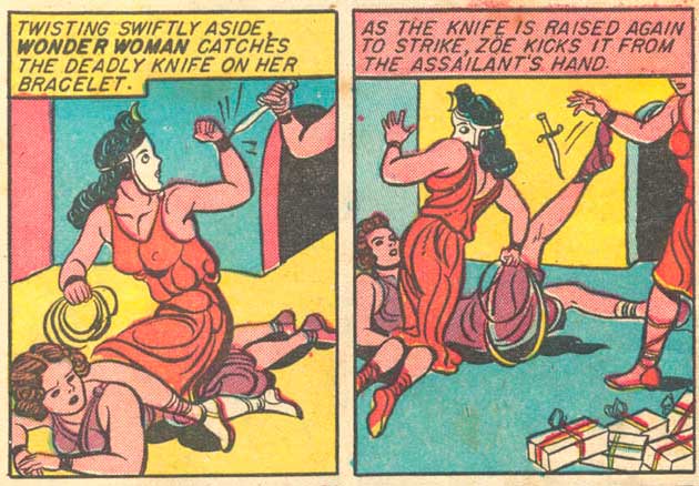
I’d rather not attempt to unpack these concepts here, except to note how Peter fits into these general conceptions. Peter’s figures are certainly naturalistic in many ways. They generally have “normal” proportions and move in natural ways (both the bodies and the faces) (a key exception here is Etta Candy, who is far more caricatural). Where the proportions are abnormal is where Peter starts to be distinguished. His characters are large in the shoulders and head, while hips, waist, and legs tend to be much narrower. He also draws men differently than woman, which is so befitting of this series one wonders how much it is a general aspect of his style and how much it is something he took on for the series. His male characters (which are very few in issue 28 and not much more plentiful in issue 3) have really outsized heads and shoulders, with angular, blocky faces with prominent cheeks, jaws, and foreheads. All of which often renders them bit grotesque. Steve Trevor is one weird looking dude (28: 10A.5, below). Peter’s women tend to be more glamour girl-ish, a gender distinction which is not unprecedented in comics. Cliff Sterritt’s Polly and Her Pals featured Polly as a stylish glamour girl while her parents were caricatured figures. The eyebrows on Peter’s woman are also quite pronounced and arced, in a way that is reminiscent of Caniff, while their eyes are often enlarged (more so in issue 28).

Peter’s figures have a strong sense of movement and dynamism to them in Issue 28. His generally curved line adds to this effect as does the way his figures curl in upon themselves. Even in action WW’s legs and arms are often bent in towards her body (leaping with legs bent in at the knee). One could almost read that as working in conjunction with Marston’s bondage themes. The characters’ actions are both freeing and restricted.
I note in comparing issues 3 and 28 that the figures in issue 3 are stiffer, a bit more awkward looking, while in issue 28 they are softer, more rounded. Another example of Peter’s evolving drawing style, though also potentially an effect of changing assistants. Personally, I find the earlier work more distinctive if considerably more rudimentary looking from a pure figure drawing point of view.
Line
Peter’s line work is one thing that really attracted me to his work when I first saw it. There was something vibrant about his lines and the way they curved and bled together that was so unusual in the early issues I read. Issue 28 is a disappointment in this regards. Peter’s inking seems to me really conventional for the issue, though it is technically competent. He has a pretty consistent line weight that tapers at the ends and thickens on the curve and to emphasis volume and shadow (a nib pen, clearly). His characters are drawn with a line that is mostly consistent to that used on the backgrounds. His blacks (most notable in this issue on the some of the villains’ clothing and on the bodies of the half-ape people) tend to be a little messy looking, a conglomeration of feathered strokes. He doesn’t make much use of pattern or texture, with the exception of costuming (stars, leopard spots, prison stripes), and the occasional banal brick pattern. The work does not show the flair that makes you really notice and appreciate him solely for the way he used a pen or brush.
Much of the above seems to work against the distinctive aspects of Peter’s style. In so many ways, his work in these issues seems so conventional for the context. Or perhaps I am missing some aspects by ignoring the color and the découpage or all the other aspects of comics I haven’t even addressed. On the whole Peter is not what you’d call an innovator: he’s not pushing the form, nor is his art particularly ostentatious.
The Idiographic
I steal this usage from Charles Hatfield’s Hand of Fire to label the distinctive aspects of an artist’s style, those that work as signs to identify that particular artist. We might say that it is a combination of all these factors (and more that I’ve surely missed) which work together as a kind of networked sign of “style,” but I think we can draw out certain aspects that veer away from the conventional aspects of the work and those indistinct aspects which were/are shared with many other artists. There is a certain amount of subjectivity to this endeavor. These are the parts of his work that I see as distinct.
The older issues of the series (like issue 3) have this scribbly, curly-cue line that is really distinctive, used in clouds and hair and foliage. The early issue also seems to be more curvy in general, where the folds in clothes, muscles and visible bone structure (knees, clavicles, shoulder blades), and flanks of animals all have a distinctive curve to them. That little bit of excess seems stripped out in issue 28. Is this just a result of Peter changing his style, becoming a little more conventional? Or is this a result of changing assistants (or adding assistants since those early issues)? It is a good reminder that style is variable over time.
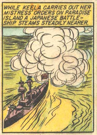
I’m particularly enamored of the clouds and puffs of smoke or gas that pepper the series (3: 6D.7; 3: 12A.4):
Or these gowns with their thick, swirling curves (3: 6A.5-6):
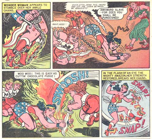
Another aspect that stands out is Peter’s drawings of the materially insubstantial–the flames and power rays–and the non-diegetic (I struggle here for the right term, the elements that are not actually there in the story world)–the motion lines and thought waves. Below is great example with the licks of flame and the “blue hypnotic ray” (28: 11B.4):

Or these panels (28: 2C.5-6) with the flames, the wavy black lines of smoke or shadow, and the little glow around the sword WW carries. The curly hair in those two panels are also very Peter to me.

The next page (28: 3C.1-4) offers some great Peter motion lines that add such dynamism to the panels (and often counteract the stiff figures in bondage).
I don’t even know what this little pink puff is (some kind of Paradise Island foliage?), but I love it (3: 10A.2):
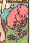
(see full panel below)
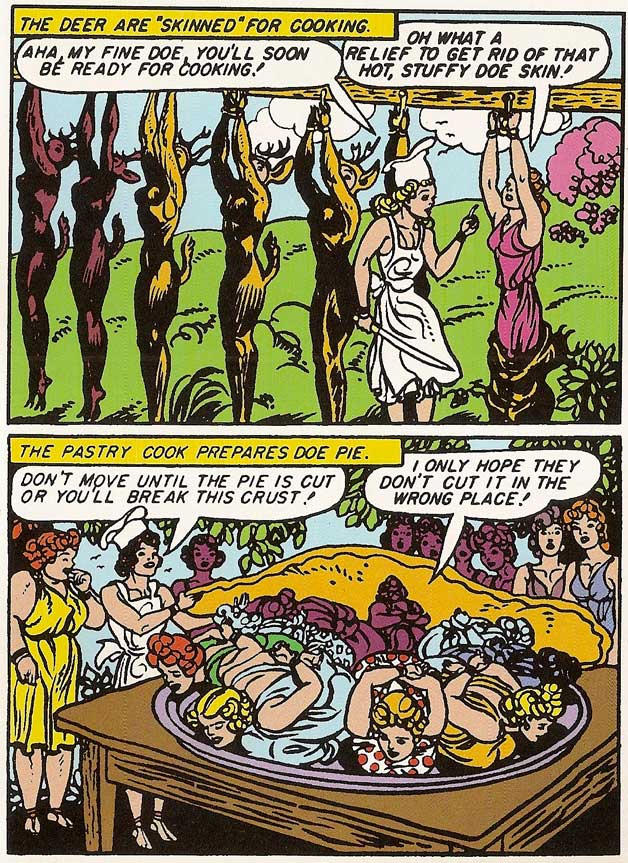
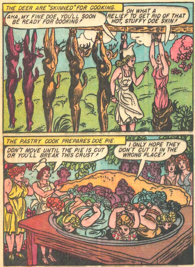
In comparing my “Archive Edition” volume with scans from the original comics (below: the top image is page 102 from the Archive volume, the second is the original), I can also see another factor that affects how one reads a style, the reproduction. The archive edition has a thicker line to it, which causes some of the tighter line work to bleed together. Some may cry foul at that, the scans and printing have changed the work, but I actually like Peter’s work that way (the updated colors are another story). The drawing takes on a bit of a woodcut flair to it because the black becomes more prominent and denser on the page. Am I perhaps then a fan of a Peter that never existed, a creation of modern reproductions, an artist in my own mind?
References
Benson, John, ed. Romance Without Tears. Fantagraphics, 2003.
Chavanne, Renaud. Composition de la Bande Dessinée. Éditions PLG, 2010.
Groensteen, Thierry. La Bande Dessinée: Mode d’Emploi. Les Impressions Nouvelles, 2007.
Hatfield, Charles. Hand of Fire: The Comics Art of Jack Kirby. U Mississippi, 2012.
Harvey, Robert C. Art of the Comic Book. U Mississippi, 1996.
Marsh, Jesse, and Gaylord DuBois. Edgar Rice Burroughs’ Tarzan: The Jesse Marsh Years. Dark Horse, 2009.
Marston, William and Harry Peter. Wonder Woman No. 3. DC Comics, 194
–. Wonder Woman No. 28. DC Comics, 1948.
–. Wonder Woman Archive Edition v.2. DC Comics, 2000.
McCloud, Scott. Understanding Comics. HarperPerennial, 1994.
Nadel, Dan, ed. Art in Time: Unknown Comic Book Adventures, 1940-1980. Abrams ComicArts, 2010.
Sadowski, Greg, ed. B. Krigstein Comics. Fantagraphics, 2004.
Wolk, Douglas. Reading Comics: How Graphic Novels Work and What They Mean. Da Capo Press, 2007.